

In Android applications, Toolbar is a kind of ViewGroup that can be placed in the XML layouts of an activity. It was introduced by the Google Android team during the release of Android Lollipop(API 21). The Toolbar is basically the advanced successor of the ActionBar. It is much more flexible and customizable in terms of appearance and functionality. Unlike ActionBar, its position is not hardcoded i.e., not at the top of an activity. Developers can place it anywhere in the activity according to the need just like any other View in android. Toolbar use material design theme features of Android and thus it provides backward compatibility up to API 7(Android 2.1). One can use the Toolbar in the following two ways:
- Use as an ActionBar: In an app, the toolbar can be used as an ActionBar in order to provide more customization and a better appearance. All the features of ActionBar such as menu inflation, ActionBarDrawerToogle, etc. are also supported in Toolbar.
- Use a standalone Toolbar: It can be used to implement a certain kind of design to an application that can not be fulfilled by an ActionBar. For example, showing a Toolbar at a position other than the top of the activity or showing multiple Toolbars in an activity.
Features of ToolBar
Features supported by the Toolbar are much more focused and customizable than the ActionBar. Following are the components that can be added to make a user-appealing Toolbar:
- Navigation button: This element is aligned vertically with respect to the minimum height of the Toolbar. It is used as a guide for switching between other destinations within an app. The appearance of this element can be in many forms such as navigation menu toggle, close, collapse, done, a simple up arrow, or any other kind of glyph required by the app.
- Brand logo/App icon: It is one of the most important aspects of an application as it provides a kind of identity. The height of the logo/icon is generally up to the height of the Toolbar but it can be extended as per the need.
- Title and Subtitle: The purpose of providing a title to the Toolbar is to give information regarding the current position within the navigation hierarchy of an app. The Subtitle is used to indicate any kind of extended information about the content.
- ActionMenuView: It is similar to the Action Buttons in ActionBar that display some important actions/elements of the app which may be required to the users frequently. Elements of this menu are placed to the end(rightmost side) of the Toolbar.
- Multiple Custom Views: Android allows developers to add one or more Views such as ImageView, TextView, etc. within the layout of the Toolbar. These views are treated as children of the Toolbar layout and their position can be adjusted according to the need.
Steps of Designing a Toolbar
Working with Toolbar is very similar to any operate a View. One can easily assign constraints, change height and width, choose a background color, and much more. To carry out these same tasks in ActionBar, extra lines of code is needed to be written. Here is an example to use the Toolbar as an ActionBar. Following is the step by step method which covers the complete procedure.
Note: Following steps are performed on Android Studio Ladybug 2024.2.2
Step 1: Adding necessary dependencies in build.gradle.kts Module-level file
In order to use Toolbar as an ActionBar, one has to include the following dependencies in the build.gradle.kts file of app module. These dependencies might be already present in the file but it always good to check it once.
implementation ("com.google.android.material:material:1.12.0")Step 2: Adding Toolbar in activity_main.xml file
Search the Toolbar View from the Palette menu present at the top left portion of the Design window. Drag and place it as a child of ConstraintLayout. To make its appearance similar to ActionBar, add the AppBarLayout in the activity_main.xml file in such a manner that the Toolbar becomes its child. Add the top, left, and right constraint of the AppBarLayout. By running the application at this point in time, one can observe both Toolbar and ActionBar(as it is the default setting) on top of the activity. Below is the code of the activty_main.xml file that will produce the discussed output.
activity_main.xml:
    xmlns:android="http://schemas.android.com/apk/res/android"
    xmlns:app="http://schemas.android.com/apk/res-auto"
    xmlns:tools="http://schemas.android.com/tools"
    android:layout_width="match_parent"
    android:layout_height="match_parent"
    tools:context=".MainActivity">


        android:layout_width="0dp"
        android:layout_height="wrap_content"
        app:layout_constraintEnd_toEndOf="parent"
        app:layout_constraintStart_toStartOf="parent"
        app:layout_constraintTop_toTopOf="parent">


            android:id="@+id/toolbar"
            android:layout_width="match_parent"
            android:layout_height="wrap_content"
            android:background="?attr/colorPrimary"
            android:minHeight="?attr/actionBarSize"
            android:theme="?attr/actionBarTheme"
            tools:layout_editor_absoluteX="0dp"
            tools:layout_editor_absoluteY="0dp" />


        android:id="@+id/textView"
        android:layout_width="wrap_content"
        android:layout_height="wrap_content"
        android:text="Hello World!"
        app:layout_constraintBottom_toBottomOf="parent"
        app:layout_constraintLeft_toLeftOf="parent"
        app:layout_constraintRight_toRightOf="parent"
        app:layout_constraintTop_toTopOf="parent" />
Output:

Step 3: Remove ActionBar (if not removed by default)
The easiest way to remove the Action Bar from the entire app is to change the default code of the themes.xml file. The theme of the parent/base application must be changed to Theme.Material3.DayNight.NoActionBar. Below is the code that will make the desired changes.
 xmlns:tools="http://schemas.android.com/tools">

     name="Base.Theme.Demo" parent="Theme.Material3.DayNight.NoActionBar">


     name="Theme.Demo" parent="Base.Theme.Demo" />
Step 4: Using Toolbar as ActionBar
The Toolbar will not display the application title unless it is declared as an ActionBar. To make the desired change, the ID of the Toolbar must be passed as an argument in the setSupportActionBar() method written inside the MainActivity file. Below is the code to do the same.
MainActivity File:
package org.geeksforgeeks.demo;

import androidx.appcompat.app.AppCompatActivity;
import androidx.appcompat.widget.Toolbar;
import android.os.Bundle;
import android.view.View;
import android.widget.TextView;

public class MainActivity extends AppCompatActivity {

    @Override
    protected void onCreate( Bundle savedInstanceState ) {
        super.onCreate(savedInstanceState);
        setContentView(R.layout.activity_main);

        // assigning ID of the toolbar to a variable
        Toolbar toolbar = (Toolbar) findViewById(R.id.toolbar);

        // using toolbar as ActionBar
        setSupportActionBar(toolbar);
    }
}
package org.geeksforgeeks.demo

import android.os.Bundle
import androidx.appcompat.app.AppCompatActivity
import androidx.appcompat.widget.Toolbar

class MainActivity : AppCompatActivity() {

    override fun onCreate(savedInstanceState: Bundle?) {
        super.onCreate(savedInstanceState)
        setContentView(R.layout.activity_main)

        // assigning ID of the toolbar to a variable
        val toolbar: Toolbar = findViewById(R.id.toolbar)

        // using toolbar as ActionBar
        setSupportActionBar(toolbar)
    }
}
Output:

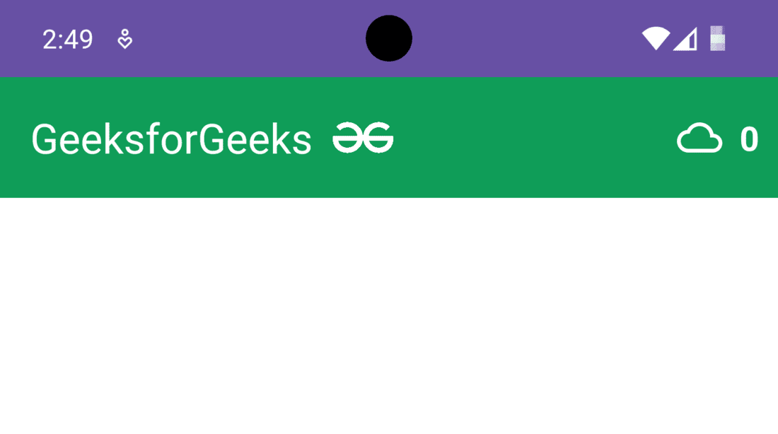
Step 5: Customize the Toolbar
Each and every component/element that will be displayed on the Toolbar is customizable. The text of the application title, its color, background color of the Toolbar can be easily modified through XML attributes. While placing various kinds of Views in the Toolbar such as ImageView, Vectors, TextView, etc. one must have the capability to control its position and dimensions. In order to do so, ConstraintLayout must be added under the AppBarLayout. With this, the hierarchy of Component Tree becomes parent ConstraintLayout of activity, after that AppBarLayout, then again ConstraintLayout as its child and finally the Toolbar view.

Further, a TextView and two ImageView are added in the same hierarchy as that of Toolbar. For the content of ImageView, vectors are used in this example. Right-click on the res folder and select new then Vector Asset. Click on the icon written beside Clip Art and select the desired image. Don't forget to give a unique name to that vector file as it will be easy to remember and to be used in code. Click on Next and then Finish.

The code of the activity_main.xml file given below will add two ImageView, one TextView, custom title, and background color in the Toolbar.
    xmlns:android="http://schemas.android.com/apk/res/android"
    xmlns:app="http://schemas.android.com/apk/res-auto"
    xmlns:tools="http://schemas.android.com/tools"
    android:layout_width="match_parent"
    android:layout_height="match_parent"
    android:background="@color/white"
    tools:context=".MainActivity">


        android:id="@+id/appBarLayout"
        android:layout_width="0dp"
        android:layout_height="wrap_content"
        app:layout_constraintEnd_toEndOf="parent"
        app:layout_constraintStart_toStartOf="parent"
        app:layout_constraintTop_toTopOf="parent">


            android:layout_width="match_parent"
            android:layout_height="match_parent">


                android:id="@+id/toolbar"
                android:layout_width="match_parent"
                android:layout_height="wrap_content"
                android:background="#0F9D58"
                android:minHeight="?attr/actionBarSize"
                android:theme="?attr/actionBarTheme"
                app:layout_constraintEnd_toEndOf="parent"
                app:layout_constraintStart_toStartOf="parent"
                app:layout_constraintTop_toTopOf="parent"
                app:title="GeeksforGeeks"
                app:titleTextColor="#ffff" />


                android:id="@+id/textView2"
                android:layout_width="wrap_content"
                android:layout_height="wrap_content"
                android:layout_marginEnd="10dp"
                android:text="0"
                android:textColor="#ffff"
                android:textSize="18sp"
                android:textStyle="bold"
                app:layout_constraintBottom_toBottomOf="parent"
                app:layout_constraintEnd_toEndOf="@+id/toolbar"
                app:layout_constraintTop_toTopOf="parent" />


                android:id="@+id/imageView2"
                android:layout_width="24dp"
                android:layout_height="24dp"
                android:layout_marginEnd="9dp"
                app:layout_constraintBottom_toBottomOf="parent"
                app:layout_constraintEnd_toStartOf="@+id/textView2"
                app:layout_constraintTop_toTopOf="parent"
                app:srcCompat="@drawable/ic_cloud"
                app:tint="@color/white" />


                android:id="@+id/imageView"
                android:layout_width="32dp"
                android:layout_height="32dp"
                android:layout_marginEnd="150dp"
                app:layout_constraintBottom_toBottomOf="parent"
                app:layout_constraintEnd_toStartOf="@+id/imageView2"
                app:layout_constraintTop_toTopOf="parent"
                app:srcCompat="@drawable/gfg_logo"
                app:tint="@color/white" />


        android:id="@+id/textView"
        android:layout_width="wrap_content"
        android:layout_height="wrap_content"
        android:text="Hello Geek!!"
        android:textSize="24sp"
        android:textStyle="bold"
        app:layout_constraintBottom_toBottomOf="parent"
        app:layout_constraintLeft_toLeftOf="parent"
        app:layout_constraintRight_toRightOf="parent"
        app:layout_constraintTop_toTopOf="parent" />
Output:
Step 6: Adding a logo and some more customization
As mentioned earlier, the developers add a logo/icon to give a unique identity to the application. While using Toolbar as an ActionBar, the logo of the application is designed exactly the same as in the ActionBar. One has to add the required code in the MainActivity file in order to add the logo in the Toolbar. Moreover, the Views added in the Toolbar can be programmed to perform some operations in the same manner as they are present in the activity. In this example, the TextView added in the Toolbar will increment its value by one on every click. Below the complete code to carry out this task.
MainActivity File:
package org.geeksforgeeks.demo;

import android.os.Bundle;
import android.widget.TextView;
import androidx.appcompat.app.AppCompatActivity;
import androidx.appcompat.widget.Toolbar;

public class MainActivity extends AppCompatActivity {

    private TextView textView;
    private int count = 0;

    @Override
    protected void onCreate(Bundle savedInstanceState) {
        super.onCreate(savedInstanceState);
        setContentView(R.layout.activity_main);

        // Assigning ID of the toolbar to a variable
        Toolbar toolbar = findViewById(R.id.toolbar);

        // Using toolbar as ActionBar
        setSupportActionBar(toolbar);

        // Display application icon in the toolbar
        if (getSupportActionBar() != null) {
            getSupportActionBar().setDisplayShowHomeEnabled(true);
            getSupportActionBar().setLogo(androidx.appcompat.R.drawable.abc_ic_search_api_material);
            getSupportActionBar().setDisplayUseLogoEnabled(true);
        }

        // Assigning ID of textView2 to a variable
        textView = findViewById(R.id.textView2);

        // "on click" operations to be performed
        textView.setOnClickListener(v -> {
            count++;
            textView.setText(String.valueOf(count));
        });
    }
}
package org.geeksforgeeks.demo

import android.os.Bundle
import android.widget.TextView
import androidx.appcompat.app.AppCompatActivity
import androidx.appcompat.widget.Toolbar

class MainActivity : AppCompatActivity() {
    private lateinit var textView: TextView
    private var count = 0

    override fun onCreate(savedInstanceState: Bundle?) {
        super.onCreate(savedInstanceState)
        setContentView(R.layout.activity_main)

        // assigning ID of the toolbar to a variable
        val toolbar: Toolbar = findViewById(R.id.toolbar)

        // using toolbar as ActionBar
        setSupportActionBar(toolbar)


        // Display application icon in the toolbar
        supportActionBar!!.setDisplayShowHomeEnabled(true)
        supportActionBar!!.setLogo(androidx.appcompat.R.drawable.abc_ic_search_api_material)
        supportActionBar!!.setDisplayUseLogoEnabled(true)

        // assigning ID of textView2 to a variable
        textView = findViewById(R.id.textView2)


        // "on click" operations to be performed
        textView.setOnClickListener {
            count++
            textView.text = buildString {
                append("")
                append(count)
            }
        }
    }
}
Output:
Advantages of Toolbar
- No hardcoded position in the app.
- Flexible design and much more customizable than ActionBar.
- Use latest Android Material theme
- Provides backward compatibility up to Android 2.1(API 7).