Bootstrap cards are an essential tool for organizing and presenting content in web projects. They provide a simple yet versatile way to create visually appealing layouts that adjust seamlessly to different devices. By the end of this article, you’ll know how to use Bootstrap card components effectively in your projects.
Why Choose Bootstrap?
Bootstrap remains one of the most popular frameworks for building responsive and mobile-first web layouts. Its key benefits include:
- Quick and Easy Responsive Design: You only need basic HTML and CSS knowledge to create stunning layouts.
- Mobile-First Approach: Bootstrap prioritizes mobile responsiveness from the ground up.
- Browser Compatibility: It works flawlessly across all major browsers.
- Flexbox-Powered Grid System: Simplifies alignment and spacing tasks.
- Extensive Components: A wide range of reusable elements like buttons, modals, and cards.
The latest version of Bootstrap introduces significant improvements, such as support for Flexbox and the versatile card component, which replaces older components like panels and thumbnails.
Key Takeaways
Bootstrap cards are versatile tools for creating organized, responsive layouts. They allow you to display various types of content like text, images, and multimedia within a stylish container. Below are some key features that make them indispensable for developers:
- Ease of Use: You can quickly create a card by combining elements like div class=”card-body”, which defines the content area, and p class=”card-text”, where textual information resides.
- Support for Multiple Content Types: Add a card title, images, or list groups to structure your content effectively.
- Responsiveness: Using Bootstrap’s grid and breakpoints, cards can adapt to any device size—from mobile to desktop.
- Customizable Design: Utility classes let you tweak the appearance, including colors, borders, and text alignment.
- Advanced Layouts: Features like card groups, decks, and masonry layouts enable seamless alignment and organization.
What Is the Bootstrap Card Component?
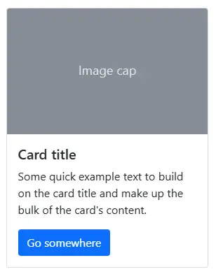
Bootstrap introduces a versatile and modern UI component called cards, which serve as flexible and stylish containers for displaying various types of content. With minimal default styling, Bootstrap cards can be easily enhanced using its wide range of utility classes.
This component is built on top of Flexbox, allowing for precise alignment and spacing. Developers can use Bootstrap’s spacing utilities to control margins and padding effectively.
Cards can conveniently accommodate different types of content like title, subtitle, body copy, and images etc., and optional header and footer sections. You can also include different sections (card blocks) to construct different types of cards depending on your use.
Key Bootstrap Card Classes
Below are the key Bootstrap card utility classes, along with their purpose:
- card: The main container class that defines the card component.
- card-body: Creates the primary content area inside the card.
- card-title: Styles the card’s title, usually used with heading tags like
.
- card-text: Used for standard textual content within the card.
- card-header: Adds a styled header section at the top of the card.
- card-footer: Adds a styled footer section at the bottom of the card.
- card-img-top: Places an image at the top of the card.
- card-img-bottom: Places an image at the bottom of the card.
- list-group: Creates a list group within the card.
- list-group-item: Styles individual items in the list group.
- card-group: Groups multiple cards together with equal width and height.
- card-deck: Aligns multiple cards with spacing, deprecated in Bootstrap 5.
- text-*: Utility classes for text color styling (e.g., text-primary, text-success).
- bg-*: Utility classes for background color styling (e.g., bg-light, bg-dark).
This concise overview lists the essential classes used to build and customize Bootstrap cards.
How to Include Bootstrap in Your Project
You can start using Bootstrap in your project effortlessly by including it from a Content Delivery Network (CDN) or downloading the necessary files from getbootstrap.com
For this example, we’ll demonstrate how to set up a simple HTML page using a CDN to include the Bootstrap card component. This method allows you to quickly create and style cards without lead in to additional configuration.
Follow the steps below to create your index.html file and include Bootstrap 5.3.3:
integrity="sha384-QWTKZyjpPEjISv5WaRU9OFeRpok6YctnYmDr5pNlyT2bRjXh0JMhjY6hW+ALEwIH" crossorigin="anonymous">
Bootstrap Card Example
Example Card Header
Example Card Title
This is an example card created using Bootstrap 5. It includes styling for the
header, title, and text.
Go somewhere
We’ve included the Bootstrap files via a CDN, ensuring the latest framework version is always available. A container division has been added to serve as a base for your content, allowing you to start building with the Bootstrap card component right away.
For more details, you can explore the starter template docs.
Creating Basic Bootstrap Cards
To create a simple card, follow these steps:
- Use the .card class with a tag to create the outer container.
- Add the .card-body class to an inner
tag to define the card body.- Use the .card-title and .card-subtitle classes with heading tags ( and ) to add the card title and subtitle.
- Use the .card-text class with tags to include textual content.
- Use the .card-img-top class with the <img> tag to add an image at the top of the card.
These are the fundamental building blocks of a basic card layout. Here’s an example:
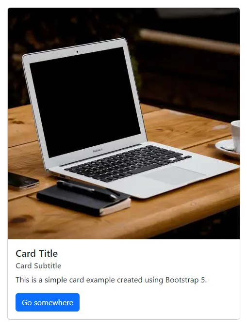
This code generates a card with an image, title, subtitle, text, and a button, and it will adjust to the width of its parent container unless specified otherwise using the style=”width: 30rem;” property.
This is a screenshot of the result:
Horizontal Cards in Bootstrap
Horizontal cards allow you to display content in a side-by-side layout, making them ideal for compact and organized designs. You can create them using grid classes for responsive behaviour, ensuring the card looks great on all devices.
Card Title
This is a card with text beside an image, perfect for showcasing content
side-by-side.Last updated 3 mins ago
This is a screenshot of the result:

List Groups in Bootstrap Cards
Bootstrap allows you to enhance your cards by including list groups, making it easier to display structured and organized content. The list-group and list-group-flush classes integrate seamlessly within cards, enabling developers to create visually appealing lists.
Here’s how you can create a card with a flush list group:
- An item
- A second item
- A third item

Enhancing Card Features
Adding Headers and Footers
You can enhance your cards by including headers and footers with the .card-header and .card-footer classes. Here’s an example:
This is a headerCard title
Card subtitle
This is a simple Card example
This is the screenshot of the result:

This layout adds more context to the card with a styled header and footer.
Overlaying Text on Images
Use .card-img-overlay to overlay content on top of the image. By simply switching the card-body class with the card-img-overlay class, we can use the image as an overlay:
This is a screenshot of the result:

Adding Card Image Caps
Add images at the top or bottom of the card using .card-img-top or .card-img-bottom.
This card has an image cap at both the top and bottom.
This is a screenshot of the result:

The card’s top and bottom images are called image caps.
Responsive Design with Bootstrap Cards
Responsive design ensures your cards look great on all devices. Use the Bootstrap grid system to control the layout.
Example Code
This is a screenshot of the result:

Adjusting Bootstrap Card Height and Width
To set a specific width for a card, you can use the style attribute or Bootstrap’s utility classes. Here’s an example:
      Card Title
      This is a simple card example with a custom width.
This is a screenshot of the result:

This card’s width is limited to 10rem, which can be adjusted based on your design needs.
Normally, the height of the card will be adjusted to vertically fit the content of the card, but we can also control it using custom CSS (for example, style=” height: 10rem;”) or Bootstrap’s sizing utilities (for example,
).Please note that the latest release of Bootstrap has switched to rem units instead of px units because rem is a scalable measurement unit — so it works better with user settings, which makes text much more accessible. The result is that all elements in the page will scale with the screen size.
You can learn more about Bootstrap’s new features in SitePoint’s “Bootstrap: Super Smart Features to Win You Over” article.
Using the Grid System to Control Width
Another option for controlling the width of the Bootstrap card component is to use the Bootstrap grid (rows and columns):
                Card Title
                This is an example card using the grid system.


                Another Card
                This card sits next to the first one.
This is a screenshot of the result:

In this example, two cards are displayed side by side, each taking up four columns (col-md-4) on medium and larger screens.
Card Styles
Bootstrap provides various options for customizing cards, including background colors, borders, and text styles.
Background and Text Colors
You can change a card’s background and text colors using utility classes like .bg-primary or .text-white.
    Primary Card Title
    Quick text to demonstrate card styling.
Border Colors
Use .border-{color} classes to customize the border color of your cards. Text inside the card can also be styled with .text-{color}.
    Success Card Title
    Simple content styled with a border.
Transparent Headers and Footers
Remove the background color from headers and footers using .bg-transparent and customize their borders.
HeaderInfo Card Title
Example content inside a card.
Mixing Backgrounds and Borders
Combine background and border utilities for unique styling.
    Mixed Style Card
    Custom card combining background and border.
Here’s the result showcasing four different card styles in a single row layout:

Bootstrap lets you create cards with different header styles
- ‘header primary card title’ for main sections
- ‘header light card title’ for subtle designs
- ‘header secondary card title’ for card with supporting text.
- ‘header dark card title’ for bold looks
- ‘header success card title’ for positive messages
- ‘header danger card title’ for warnings.
With these versatile card styling options, you can also create unique designs like a “header warning card title”, “header info card title” to emphasize critical information or draw attention to specific details seamlessly.
Adding Navigation
Another nice feature of the Bootstrap card component is the possibility of adding advanced navigation patterns to the header section such as tabs and navigation pills.
Adding Tabs to the Card Header
To include tabs in the card’s header, use the .nav-tabs and .card-header-tabs classes on an unordered list (
- ). Here’s an example:
- .text-start for card text left alignment
- .text-end for card text right alignment
- .text-center for card text center alignment
- .text-justify for card text justified alignment (applies to older versions, deprecated in Bootstrap 5)
- .text-nowrap to prevent text from wrapping
- .text-lowercase to transform text to lowercase
- .text-uppercase to transform text to uppercase
- .text-capitalize to capitalize the first letter of each word
- Text Colors: Use .text-primary, .text-success, .text-danger, .text-warning, .text-info, .text-light, .text-dark, or .text-white to change the text color.
- Background Colors: Use .bg-primary, .bg-success, .bg-danger, .bg-warning, .bg-info, .bg-light, .bg-dark, or .bg-white to change the background color.
- Border Colors: Use .border-primary, .border-success, .border-danger, .border-warning, .border-info, .border-light, .border-dark, or .border-white to style the border color.
This is the screenshot of the result:

Adding Pills to the Card Header
In the same way, we can add navigation pills by simply replacing .nav-tabs with .nav-pills and .card-header-tabs with .card-header-pill on the
- list tag:
This is the screenshot of the result:

You can find out more information about this in the Bootstrap navigation components documentation
Adding Links to the Bootstrap Card Component
We can quickly add links inside cards using the tag with a .card-link class:
This is the screenshot of the result:

Aligning and Transforming Text in Bootstrap Card Components
Bootstrap provides text utility classes to align and transform text within a card component. For text alignment, you can use the following classes:
You can also transform text using the following classes:
Customizing Bootstrap Card Component Background, Foreground and Border Colors
You can customize a Bootstrap card’s background, text, and border colors using text and background utility classes. Here are some examples:
The CodePen demo below shows all the different kinds of cards we can create with Bootstrap. Feel free to experiment with it on your own:
See the Pen Bootstrap 5 Card Examples by Poorna Theekshana (@poorna-theekshana) on CodePen.
Creating Advanced Layouts With the Bootstrap Card Component
The Bootstrap card is a versatile UI component widely utilized in modern web layouts to display mixed content types (such as text and images) as either a single entity or grouped collections.
Cards are especially useful for responsive design and are commonly implemented in layouts like the Masonry layout, also known as the Pinterest-like layout.

Cards can be used to create layouts for image galleries, blog posts, or e-commerce products. Major platforms like Google and Facebook leverage cards extensively for organizing and displaying content on their web applications.
Previously, building such advanced layouts required deep knowledge of CSS and HTML. However, with Bootstrap’s latest features, developers can create responsive and visually appealing card-based layouts effortlessly.
Classes like .card-group, .card-deck, and .card-columns simplify the process of organizing cards with consistent styling and alignment.
Grouping/Nesting Cards
Card groups in Bootstrap are an efficient way to display multiple card components as a single, attached entity with uniform width and height.
This layout is achieved using the display: flex; property, ensuring all cards align perfectly. It’s particularly useful for responsive design and modern web layouts where consistent card dimensions are essential.
To create a group of cards, use the .card-group class as a wrapper div containing individual cards.
Here’s an example showcasing a group of three cards:
This is a screenshot of the result:

As can be seen, the three cards are attached and have the same width and height.
Card Decks
In earlier versions of Bootstrap, .card-deck was used to create card layouts where cards had the same width and height but were not attached to each other. However, in Bootstrap 5, the grid system is recommended for this purpose. This approach offers greater flexibility and responsiveness.
To achieve a similar layout, use the .row class with .col to control card spacing and alignment. Here’s an example:

As we can see, the cards are of the same size with some margin between them.
Card Columns
In earlier versions of Bootstrap, the .card-columns class was used to create a Masonry-like layout where cards were added from top to bottom and left to right. However, in Bootstrap 5, this feature has been removed.
To achieve a similar layout, you can use the grid system in combination with the CSS Masonry layout or a JavaScript plugin like Masonry.js for more complex behaviours.
Here’s how to create a simple Masonry-style layout using the grid system and CSS:
See the Pen Masonry-style layout using the grid by Poorna Theekshana (@poorna-theekshana) on CodePen.
Optimizing Performance
Efficient performance is crucial for creating Bootstrap cards that load quickly and adapt seamlessly. Here are practical techniques to enhance performance while integrating Bootstrap card components like div class card body and h5 class card title.
Lazy Loading Images
Lazy loading delays loading images until they are visible in the viewport, optimizing page speed. Use the loading=”lazy” attribute with card img top for an efficient solution.
Optimize Image Sizes
Resize images to fit their container dimensions, ensuring faster load times. Use img-fluid with div class card img to automatically scale images.
This ensures the card img top fits perfectly, regardless of the parent element width.
Minify CSS and JavaScript
Minify styles and scripts to reduce file sizes. Combine multiple div class card header elements and minimize custom CSS for faster rendering.
Optimized Example
Instead of applying repetitive or custom styles like this:
Custom CSS Header
This card uses inline styles, which are inefficient.
Use Bootstrap’s utility classes for a cleaner and more maintainable structure:
Utility Classes Header
Using Bootstrap's utility classes ensures better performance and maintainability.
Use SVGs for Icons
SVGs are lightweight and scalable, making them ideal for card headers and decorative elements. They load faster and maintain sharpness across devices.
Example
SVG Optimized Header
SVGs provide clear visuals with minimal overhead.
Preload and Prefetch Resources
Use rel=”preload” to load critical resources and rel=”prefetch” for anticipating future needs. This is especially useful for heavy card content.
Example
Reduce DOM Complexity
Avoid overly nested div class card structures that can slow down rendering. Simplify layouts to optimize performance.
Before Optimization
Nested Content
After Optimization
Optimized Content
Optimize Fonts
Preload custom fonts or use system fonts to reduce latency. A clean div class card body can further highlight the visual appeal of your cards.
Example
Optimized Font
Preloading ensures faster rendering for card content.
Conclusion
The Bootstrap card component is a powerful addition to the Bootstrap framework, which allows developers to create modern-style web pages without going deeply into how CSS works. You can add card layouts to represent image galleries, dashboard widgets, and display blog posts or products for an e-commerce website by adding CSS classes.
As a result of the new features and components, Bootstrap continues to be a powerful CSS framework available to everyone, particularly to developers who need to create their own responsive and modern-style layouts but lack enough time and budget or the deep knowledge of CSS necessary to produce custom code.
If you’ve got the basics of Bootstrap under your belt but are wondering how to take your Bootstrap skills to the next level, check out our Building Your First Website with Bootstrap 4 course for a quick and fun introduction to the power of Bootstrap.
FAQs on Mastering Bootstrap Card Components for Responsive Design
What Is a Bootstrap Card Component?
A Bootstrap Card Component is a modern and flexible container for content, enabling you to create visually appealing layouts for text, images, and multimedia. Cards are part of Bootstrap’s framework, designed to help developers organize information in a responsive and mobile-friendly manner.
How Do I Create a Bootstrap Card Component?
Creating a Bootstrap Card Component is straightforward. You can use a div with the class card as the container and add content like titles, text, and images within it. Here’s an example:
Card Title
This is an example of a Bootstrap card body.
How to Set Height and Width of Card in Bootstrap?
You can customize the bootstrap card width and height of a card using inline styles or Bootstrap’s utility classes. For example:
Custom Card
This card has a custom height and width.
Alternatively, you can also use card height bootstrap utility classes like w-50 or h-100 to set card dimensions responsively.
How to Resize Card in Bootstrap?
To resize a card, you can use card size bootstrap utility classes like w-25, w-50, or w-75 for width, and h-auto or h-100 for height. This ensures your card adapts to the layout without lead in to additional CSS. Here’s an example:
Responsive Card
This card resizes based on its parent container.
How Do I Create a Card Title in Bootstrap?
To add a title to your card, use an
element with the class=”card-title”. This class ensures the title is styled consistently with Bootstrap’s design standards.
Card Title
This is an example of a Bootstrap card with a title.
How Can I Use the card-body Class in Bootstrap?
The card-body class is a utility class that provides padding and organizes content within a Bootstrap card. It is the main container for a card’s content.
Using card-body
This is the content inside the card-body section.
How to Fix Bootstrap Card Size?
To fix the size of a card, apply specific width and height using inline styles or utility classes. For instance:
Fixed Size Card
This card has a fixed size for consistency.
How to Adjust Card Size in Bootstrap?
Card size can be adjusted dynamically using Bootstrap’s utility classes or CSS Grid. Here’s an example of responsive card sizing:
Card 1
Adjustable size based on parent grid.
Can I Customize Bootstrap Card Backgrounds and Borders?
Yes, Bootstrap offers extensive customization utility classes. Use bg-primary for background colors and border-success for border styling. Example:
Custom Background
This card has a custom background and border.
How Can I Use Images with Cards?
Bootstrap supports images within cards using card-img-top or card-img-bottom. Example:
Card with Image
This card includes a top image.
How to Use div class card body in Bootstrap?
The div class card body in Bootstrap defines the main content area inside a card. It provides padding and ensures consistent spacing for text, images, and other elements within the card.
Card Title
This is some text within a card body.
What is p class card text in Bootstrap?
The p class card text in Bootstrap is used to style textual content inside the card body. It applies default typography styles to make the text look clean and professional.
This is an example of styled text inside a Bootstrap card.
How to Increase Card Size in Bootstrap?
To increase the card size, adjust its width and height using w-100 for full width or specify dimensions using styles. Example:
Large Card
This card has an increased size for visibility.
How Can I Make Cards the Same Height?
Use .d-flex and .align-items-stretch:
Card 1
Aligned with others.
 Ahmed Bouchefra
Ahmed is a technical author and web developer living in Morocco with a Master's degree in software development. He authors technical content about JavaScript, Angular and Ionic. He is also a fan of entrepreneurship, poetry, and teaching. You can contact me on my personal website and read my other articles on Techiediaries.
This site is protected by reCAPTCHA and the Google Privacy Policy and Terms of Service apply. - Add the .card-body class to an inner