
Nearly half the websites we scanned had text without enough contrast to read comfortably. More than a third had at least one link that a screen reader announces as just "link", with nothing after it.
We pulled 1,025 websites that had been run through a free website accessibility checker between March and September 2026, and counted which problems showed up most often. Most of the list is small, repetitive, and fixable in a few lines of HTML or CSS. That's the good news. The bad news is that the same handful of mistakes keeps shipping to production.
Key takeaways
- Low color contrast was the most common issue, affecting 46.9% of sites.
- Three of the top ten are the same bug: a link, button or iframe with no name that assistive technology can announce.
- Most fixes take one attribute or one CSS rule, and they usually live in shared components, so one change fixes every page.
How we got the numbers
The method affects how you should read the results, so here it is up front:
- One result per site. Each website counts once, using its most recent completed scan, with
www.stripped soexample.comandwww.example.comcount as one site. Test domains were excluded. - More than the home page. About 40% of the scans crawled several pages of a site. The rest checked a single page, usually the home page. A site counts as having an issue if it showed up on any scanned page, so sites with more pages scanned had more chances to be flagged.
- Not a random sample. Just over half the sites were scanned as part of industry samples of business websites. The rest were submitted by people checking their own or their clients' sites, some of whom probably already suspected problems.
- Two rule sets. Most checks come from axe-core, the open-source engine built by Deque that also powers Lighthouse's accessibility audit. The rest are custom checks added on top, including link text quality and tap target size. Those are marked in the table.
- Merged image rules. axe reports missing alt text on
andas separate rules. We merged them into one row because the fix and the user impact are the same. - Contrast is undercounted. A scanner can only measure contrast when it can read both colors, so text over images, gradients and video is left for manual review and isn't counted here.
- A snapshot in time. Each result reflects one scan between March and September 2026. Some sites may have fixed issues since, and others may have added new ones.
- Automated testing covers only part of WCAG. No scanner can tell you whether your alt text is accurate, whether focus order makes sense, or whether a custom dropdown works with a keyboard. Treat these numbers as a floor.
The top 10
| Rank | Issue | WCAG | Level | Sites affected |
|---|---|---|---|---|
| 1 | Low color contrast | 1.4.3 | AA | 46.9% (481) |
| 2 | Links with no accessible name | 2.4.4, 4.1.2 | A | 38.8% (398) |
| 3 | Touch targets under 44×44px* | 2.5.5 | AAA | 34.5% (354) |
| 4 | Images with no text alternative | 1.1.1 | A | 20.1% (206) |
| 5 | Skipped heading levels | Best practice | — | 14.0% (143) |
| 6 | Iframes with no title | 4.1.2 | A | 12.2% (125) |
| 7 | Buttons with no accessible name | 4.1.2 | A | 10.3% (106) |
| 8 | Generic link text ("click here")* | 2.4.4 | A | 9.9% (101) |
| 9 | ARIA attributes the element doesn't support | 4.1.2 | A | 9.5% (97) |
| 10 | Zoom disabled in the viewport meta tag | 1.4.4 | AA | 7.7% (79) |
- Custom check, not part of axe-core.
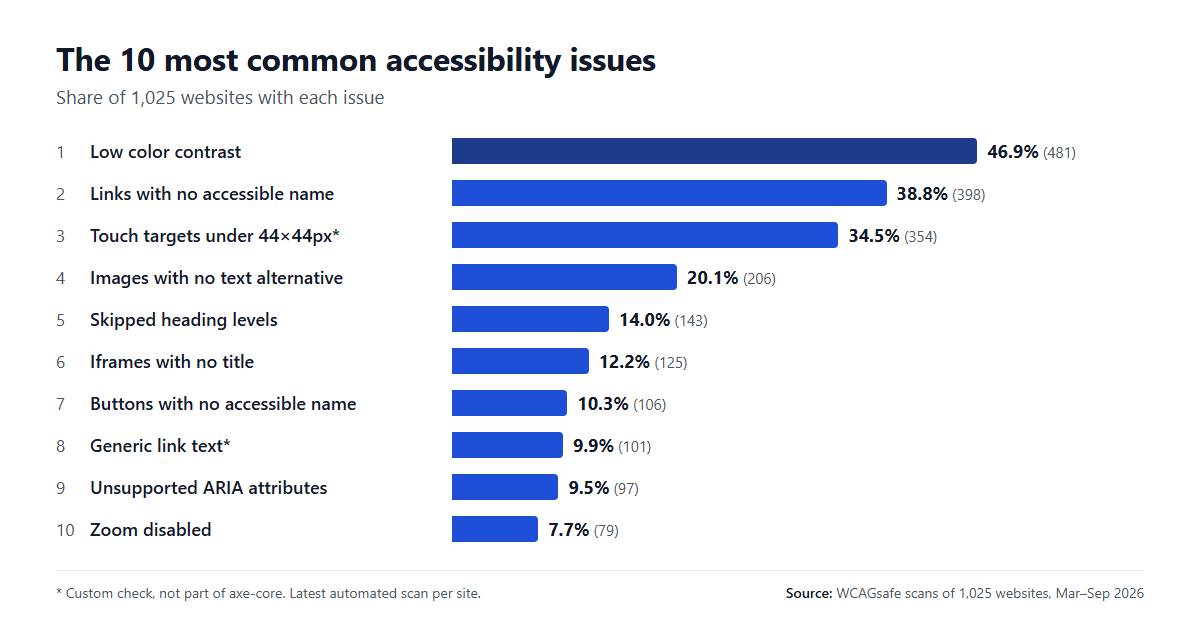
For comparison, the WebAIM Million 2026 found detectable WCAG failures on 95.9% of the top one million home pages, with an average of 56.1 errors per page. Its contrast failure rate (83.9%) is far higher than ours. Part of that gap comes from the different sample. The rest is down to how axe works: it only reports a contrast failure when it can measure both colors, so text over images and gradients is left for manual review and doesn't get counted.
1. Low color contrast (46.9%)
WCAG 1.4.3 requires a contrast ratio of at least 4.5:1 for normal text and 3:1 for large text (24px, or about 18.7px bold). The failures we see most are light grey body text, pale form labels, and white text on brand-colored buttons.
A typical example:
/* 4.13:1 — fails for normal-size text */
.alert {
  background: #e53e3e;
  color: #fff;
}
That red looks fine at a glance, but it falls just short. A slightly darker shade passes without changing the design much:
/* 5.47:1 — passes AA */
.alert {
  background: #c53030;
  color: #fff;
}
For AAA (7:1), #9b2335 gets you to 7.82:1. Don't trust your eyes on this one. Chrome DevTools' color picker shows the ratio live as you adjust the color.
2. Links with no accessible name (38.8%)
This is axe's link-name rule. It fires when a link has no text a screen reader can announce. The usual culprit is an icon link: social icons in the footer, a logo image with no alt text inside a link, a cart icon in the header.
<a href="https://github.com/acme">
  <svg viewBox="0 0 24 24"><path d="..."/>svg>
a>
<a href="https://github.com/acme" aria-label="Acme on GitHub">
  <svg viewBox="0 0 24 24" aria-hidden="true"><path d="..."/>svg>
a>
aria-label is fine here because the link has no visible text for it to conflict with. Hiding the SVG stops some screen readers from trying to read it as well.
These are easy to miss by eye, because the icon looks perfectly clear on screen. A browser-based checker finds them in seconds. axe DevTools, WAVE and this free accessibility checker Chrome extension all list every unnamed link on the page you have open.
3. Touch targets under 44×44px (34.5%)
This comes from a custom check, and it is stricter than WCAG's AA requirement. It uses the 44×44 CSS pixel size from WCAG 2.5.5, which is Level AAA. WCAG 2.2 added 2.5.8 at Level AA with a lower minimum of 24×24px, plus a spacing exception. So a flagged site won't necessarily fail AA. A 20px close button is still hard to hit for someone with a tremor, or for anyone holding a phone on a moving bus.
Inline links inside a paragraph are exempt from both WCAG criteria and from this check. The problems are usually standalone controls: icon buttons, carousel dots, pagination numbers and footer social icons.
.icon-button {
  display: inline-flex;
  align-items: center;
  justify-content: center;
  min-width: 44px;
  min-height: 44px;
}
The icon itself can stay 20px. The extra space around it becomes tappable without changing how the button looks.
4. Images with no text alternative (20.1%)
Every meaningful image needs a text alternative (WCAG 1.1.1). Decorative images need an empty one so screen readers skip them.
<img src="q3-revenue.png" alt="Revenue grew 18% in Q3, from $2.1M to $2.5M">


<img src="divider-flourish.svg" alt="">
An empty alt="" works on its own, with no need for role="presentation" alongside it. The failure is leaving the attribute out entirely. Some screen readers then fall back to the file name, and "IMG underscore 4 0 3 2 dot jpeg" helps nobody.
For inline SVGs that carry meaning, add a role and a name:
<svg role="img" aria-label="4.8 out of 5 stars" viewBox="0 0 100 20">...svg>
Charts, logos and images inside links each need slightly different alt text. This WCAG 2.1 AA developer guide has code fixes for each case, plus forms and focus management.
5. Skipped heading levels (14.0%)
An followed directly by an isn't a WCAG failure by itself; axe treats heading order as a best practice. It still matters. Screen reader users often jump from heading to heading to get the shape of a page, and a skipped level suggests a section is missing.
The usual cause is picking a heading level for its default font size. Choose the level from the document structure, then style it with CSS:
<h2>Pricingh2>
<h3 class="text-small">Monthly plansh3>
6. Iframes with no title (12.2%)
Embedded maps, videos, booking widgets and chat tools often arrive as a pasted