Syncfusion.Blazor.Navigations
35.1.39
Prefix Reserved
dotnet add package Syncfusion.Blazor.Navigations --version 35.1.39
NuGet\Install-Package Syncfusion.Blazor.Navigations -Version 35.1.39
paket add Syncfusion.Blazor.Navigations --version 35.1.39
#r "nuget: Syncfusion.Blazor.Navigations, 35.1.39"
#:package Syncfusion.Blazor.Navigations@35.1.39
#addin nuget:?package=Syncfusion.Blazor.Navigations&version=35.1.39
#tool nuget:?package=Syncfusion.Blazor.Navigations&version=35.1.39
Syncfusion Blazor Navigation Components
A comprehensive suite of Blazor navigation and menu components for building application menus, sidebars, tabs, breadcrumbs, and step-based interfaces. Includes TreeView, Dropdown Tree, Tab, Menu Bar, Sidebar, Accordion, Breadcrumb, Toolbar, Context Menu, Carousel, AppBar, and Stepper components.
Using this package with an AI coding agent
Before generating Syncfusion code, ask your AI coding agent to run the Syncfusion setup using the following prompt:
Set up this project for Syncfusion before generating code. Fetch and follow the official instructions at https://ai.syncfusion.com, then report the detected platform, installed skill pack, MCP status, and any required licensing action.The setup detects your project's platform and loads the appropriate Syncfusion skill pack. No Syncfusion account or MCP key is required to install or read Syncfusion agent skills.
Platform reference: https://ai.syncfusion.com/blazor/llms.txt
Supported Components
This package includes the following components:
- Blazor TreeView
- Blazor Dropdown Tree
- Blazor Tab
- Blazor Menu Bar
- Blazor Pager
- Blazor Sidebar
- Blazor Accordion
- Blazor Breadcrumb
- Blazor Toolbar
- Blazor Context Menu
- Blazor Carousel
- Blazor AppBar
- Blazor Stepper
Blazor TreeView Component
The Blazor TreeView Component represents hierarchical data in a tree-like structure with advanced navigation and data management capabilities.
Key Features:
- Hierarchical Data: Display data in a tree structure with parent-child relationships
- Load on Demand: Lazy load child nodes for better performance
- Multiple Selection: Select one or multiple nodes
- Drag and Drop: Reorder nodes with drag-and-drop functionality
- Node Editing: Edit node text in-place
- Checkboxes: Support for checkbox selection
- Templates: Custom templates for node rendering
- Tree Navigation: Keyboard navigation support

Documentation:
- Getting Started with Blazor Web App
- Getting Started with Blazor WebAssembly App
- Feature Overview
- Live Demos
- API Reference
Blazor Dropdown Tree Component
The Blazor Dropdown Tree Component allows selection from hierarchical data displayed in a tree structure with single or multiple selection modes.
Key Features:
- Hierarchical Selection: Select from tree-structured data
- Single/Multiple Selection: Single or multi-select modes
- Checkboxes: Checkbox support for easy selection
- Templates: Custom item and popup templates
- Data Binding: Support for arrays and remote data
- Keyboard Navigation: Full keyboard support
- UI Customization: Custom CSS and themes

Documentation:
- Getting Started with Blazor Web App
- Getting Started with Blazor WebAssembly App
- Feature Overview
- Live Demos
- API Reference
Blazor Tab Component
The Blazor Tab Component organizes related content into compact, easy-to-navigate tabs with customizable headers and animations.
Key Features:
- Tab Organization: Organize content into multiple tabs
- Animations: Built-in animation effects for tab switching
- Header Styles: Customizable tab header appearance
- Close Buttons: Optional close button for each tab
- Scrolling: Scrollbar or pop-up for many tabs
- Templates: Rich content templates
- Keyboard Navigation: Full keyboard support
- Responsive Design: Adapts to different screen sizes

Documentation:
- Getting Started with Blazor Web App
- Getting Started with Blazor WebAssembly App
- Feature Overview
- Live Demos
- API Reference
Blazor Menu Bar Component
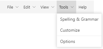
The Blazor Menu Bar Component serves as a navigation header with support for hierarchical menus, icons, and data binding.
Key Features:
- Navigation Header: Serves as main navigation for applications
- Data Binding: Support for arrays and remote data sources
- Templates: Custom item and icon templates
- Icons: Built-in icon positioning and support
- Multilevel Menus: Support for nested menu items
- Horizontal/Vertical: Both layout orientations
- Keyboard Navigation: Full keyboard support
- RTL Support: Right-to-left text direction
Documentation:
- Getting Started with Blazor Web App
- Getting Started with Blazor WebAssembly App
- Feature Overview
- Live Demos
- API Reference
Blazor Pager Component
The Blazor Pager component has an option to split the data set into sectioned pages for a great experience by viewing them page by page through an intuitive UI. Navigation is the key role of this component and it can be done with built-in numeric elements and buttons that can also be customized with rich APIs.
Key Features:
- DataSet: Easily split the data set into pages, to view them through an intuitive UI
- Customization: Flexible and highly customizable interface
- Responsive Design: Mobile-first responsive design that adapts to any resolution
- Component Integration: Effortlessly integrates with components like DataGrid, Card, ListView, etc. to view the sectioned pages
- Themes: Comes with industry standard themes such as Material, Fabric, Bootstrap, and more
Documentation:
- Getting Started with Blazor Web App
- Getting Started with Blazor WebAssembly App
- Feature Overview
- Live Demos
- API Reference
Blazor Sidebar Component
The Blazor Sidebar Component is an expandable and collapsible container for primary or secondary navigation content alongside main content.
Key Features:
- Expandable/Collapsible: Toggle sidebar visibility
- Side Positioning: Place on left or right side
- Any Content: Support for HTML content and Blazor components
- Animation: Smooth open/close animations
- Auto-Close: Optional automatic closing on item selection
- Responsive: Adapts to different screen sizes
- Templates: Custom content rendering
- Accessibility: Full keyboard navigation support

Documentation:
- Getting Started with Blazor Web App
- Getting Started with Blazor WebAssembly App
- Feature Overview
- Live Demos
- API Reference
Blazor Accordion Component
The Blazor Accordion Component displays collapsible panels with headers that expand or collapse vertically, allowing one or more panels to be open simultaneously.
Key Features:
- Collapsible Panels: Vertically stacked expandable panels
- Multiple Open Panels: Allow multiple panels open at once
- Single Panel Mode: Ensure only one panel open
- Animations: Smooth expand/collapse animations
- Headers: Customizable panel headers
- Templates: Rich content templates
- Keyboard Navigation: Full keyboard support
- Responsive: Adapts to different screen sizes

Documentation:
- Getting Started with Blazor Web App
- Getting Started with Blazor WebAssembly App
- Feature Overview
- Live Demos
- API Reference
Blazor Breadcrumb Component
The Blazor Breadcrumb Component displays the current location within a hierarchical structure, helping users understand their position and navigate back to parent pages.
Key Features:
- Hierarchical Navigation: Display navigation path
- Current Location: Highlight current page in breadcrumb
- Navigation Links: Navigate to parent pages
- Icons: Icon support in breadcrumb items
- Templates: Custom item rendering
- Data Binding: Support for dynamic data
- Keyboard Navigation: Full keyboard support
- Responsive: Adapts to different screen sizes

Documentation:
- Getting Started with Blazor Web App
- Getting Started with Blazor WebAssembly App
- Feature Overview
- Live Demos
- API Reference
Blazor Toolbar Component
The Blazor Toolbar Component provides a command interface with various command buttons and responsive modes for different screen sizes.
Key Features:
- Command Interface: Display buttons for frequently used commands
- Responsive Modes: Scrollable and pop-up modes for small screens
- Templating: Custom item templates
- Button Alignment: Align items based on priority
- Icons: Built-in icon support
- Keyboard Navigation: Full keyboard support
- Data Binding: Support for dynamic data

Documentation:
- Getting Started with Blazor Web App
- Getting Started with Blazor WebAssembly App
- Feature Overview
- Live Demos
- API Reference
Blazor Context Menu Component
The Blazor Context Menu Component appears on right-click or touch-hold, providing contextual actions based on the clicked element.
Key Features:
- Right-Click Menu: Show menu on right-click or touch-hold
- Multilevel Menus: Support for nested menu items
- Templates: Custom item rendering
- Data Binding: Support for dynamic data sources
- Icons: Built-in icon support
- Event Handlers: Attach events to menu items
- Keyboard Navigation: Full keyboard support
- UI Customization: Custom CSS and themes

Documentation:
- Getting Started with Blazor Web App
- Getting Started with Blazor WebAssembly App
- Feature Overview
- Live Demos
- API Reference
Blazor Carousel Component
The Blazor Carousel Component displays images, content, and links in a slide show format, ideal for galleries and featured content.
Key Features:
- Image Slideshow: Display images in rotating carousel
- Slide Content: Include text, links, and custom content
- Navigation: Previous/Next buttons and indicators
- Auto-Play: Automatic slide rotation with configurable intervals
- Animations: Smooth transition effects between slides
- Responsive: Adapts to different screen sizes
- Templates: Custom slide templates
- Keyboard Navigation: Arrow key support

Documentation:
- Getting Started with Blazor Web App
- Getting Started with Blazor WebAssembly App
- Feature Overview
- Live Demos
- API Reference
Blazor AppBar Component
The Blazor AppBar Component displays information and actions related to the current application screen, including branding, titles, navigation, and actions.
Key Features:
- Application Header: Display app branding and title
- Navigation: Include navigation elements
- Action Buttons: Display contextual actions
- Customizable: Flexible layout and positioning
- Responsive: Adapts to different screen sizes
- Theming: Built-in themes and customization

Documentation:
- Getting Started with Blazor Web App
- Getting Started with Blazor WebAssembly App
- Feature Overview
- Live Demos
- API Reference
Blazor Stepper Component
The Blazor Stepper Component guides users through a series of steps or stages in a process, with customizable step types and orientations.
Key Features:
- Step Navigation: Guide users through multi-step processes
- Step Types: Linear or non-linear navigation
- Orientations: Horizontal and vertical layouts
- Label Positions: Customize label placement
- Step Status: Display step completion status
- Templates: Custom step content templates
- Responsive: Adapts to different screen sizes
- Accessibility: Full keyboard navigation support

Documentation:
- Getting Started with Blazor Web App
- Getting Started with Blazor WebAssembly App
- Feature Overview
- Live Demos
- API Reference
System Requirements
- .NET 8.0 or later (Blazor Web App, Blazor Server, Blazor WebAssembly and Blazor Hybrid)
- See full requirements: System Requirements.
Installation
Install the Navigations package and the themes package, which provides the stylesheets referenced below:
dotnet add package Syncfusion.Blazor.Navigations
dotnet add package Syncfusion.Blazor.Themes
Add stylesheet and script references
- For Blazor Server App / Blazor Web App, add these to
Components/App.razororApp.razor. - For Blazor WebAssembly App: add these to
wwwroot/index.html.
Quick Start
Register the Syncfusion Blazor services in Program.cs:
using Syncfusion.Blazor;

builder.Services.AddSyncfusionBlazor();
Accordion
AppBar
@using Syncfusion.Blazor.Navigations
@using Syncfusion.Blazor.Buttons
Breadcrumb
@using Syncfusion.Blazor.Navigations
Carousel
@using Syncfusion.Blazor.Navigations

Golden Gate Bridge, San Francisco

Spring Flower Trees

Oddadalen Waterfalls, Norway

Anse Source d'Argent, Seychelles

Stonehenge, England
Context Menu
Right click/Touch hold to open the ContextMenu
DropDownTree
@using Syncfusion.Blazor.Navigations


@code {
    List Data = new List
    {
        new EmployeeData() {Id="1", Name = "Steven Buchanan", HasChild=true, Expanded=true},
        new EmployeeData() {Id="2", PId="1", Name = "Laura Callahan", HasChild=true},
        new EmployeeData() {Id="3", PId="2", Name = "Andrew Fuller", HasChild=true },
        new EmployeeData() {Id="4", PId="3", Name = "Anne Dodsworth" },
        new EmployeeData() {Id="5", PId="3", Name = "Lilly" }
    };
    public class EmployeeData
    {
        public string? Id { get; set; }
        public string? Name { get; set; }
        public bool HasChild { get; set; }
        public bool Expanded { get; set; }
        public string? PId { get; set; }
    }
}
Menu
Pager
@using Syncfusion.Blazor.Data
@using Syncfusion.Blazor.Navigations
@using Syncfusion.Blazor.Lists


 @{
    var listData = ListData.Skip(SkipValue).Take(TakeValue).ToList();


}


@code {
    SfPager Page;
    public SfListView List { get; set; }
    public int SkipValue;
    public int TakeValue = 5;
    List ListData = new List();
    protected override void OnInitialized()
    {
        base.OnInitialized();
        ListData.Add(new DataModel { Name = "Nancy, Berlin, France" });
        ListData.Add(new DataModel { Name = "Andrew, Madrid, Germany" });
        ListData.Add(new DataModel { Name = "Janet, London, Brazil" });
        ListData.Add(new DataModel { Name = "Margaret, Marseille, Belgium" });
        ListData.Add(new DataModel { Name = "Steven, Cholchester, Switzerland" });
        ListData.Add(new DataModel { Name = "Laura , Tsawassen, Venezuela" });
        ListData.Add(new DataModel { Name = "Robert, Tacoma, Austria" });
        ListData.Add(new DataModel { Name = "Michael, Redmond, Mexico" });
        ListData.Add(new DataModel { Name = "Albert, Kirkland, USA" });
        ListData.Add(new DataModel { Name = "Nolan, London, Sweden" });
        ListData.Add(new DataModel { Name = "Jennifer, Berlin, Finland" });
        ListData.Add(new DataModel { Name = "Carter, Madrid, Italy" });
        ListData.Add(new DataModel { Name = "Allison, Marseille, Spain" });
        ListData.Add(new DataModel { Name = "John, Tsawassen, UK" });
        ListData.Add(new DataModel { Name = "Susan, Redmond, Ireland" });
        ListData.Add(new DataModel { Name = "Lydia, Cholchester, Portugal" });
        ListData.Add(new DataModel { Name = "Kelsey, London, Canada" });
        ListData.Add(new DataModel { Name = "Jessica, Kirkland, Denmark" });
        ListData.Add(new DataModel { Name = "Robert, Berlin, Austria" });
        ListData.Add(new DataModel { Name = "Shelley, Tacoma, Poland" });
        ListData.Add(new DataModel { Name = "Vanjack, Tsawassen, Norway" });
        ListData.Add(new DataModel { Name = "shelley, Cholchester, Argentina" });
        ListData.Add(new DataModel { Name = "Lydia, Kirkland, Finland" });
        ListData.Add(new DataModel { Name = "Jessica, Madrid, Sweden" });
        ListData.Add(new DataModel { Name = "Nolan, London, UK" });
        ListData.Add(new DataModel { Name = "Jennifer, Redmond, Italy" });
    }
    public void Click(PagerItemClickEventArgs args)
    {
        SkipValue = (args.CurrentPage * Page.PageSize) - Page.PageSize;
        TakeValue = Page.PageSize;
    }
    public class DataModel
    {
        public string Name { get; set; }
        public string Id { get; set; }
    }
}
Sidebar
@using Syncfusion.Blazor.Navigations
Header
Sidebar
Main content
Stepper
Tab
Toolbar
TreeView
@using Syncfusion.Blazor.Navigations


@code{
    public class MailItem
    {
        public string? Id { get; set; }
        public string? ParentId { get; set; }
        public string? FolderName { get; set; }
        public bool Expanded { get; set; }
        public bool HasSubFolders { get; set; }
    }
    List MyFolder = new List();
    protected override void OnInitialized()
    {
        base.OnInitialized();
        MyFolder.Add(new MailItem
        {
            Id = "1",
            FolderName = "Inbox",
            HasSubFolders = true,
            Expanded = true
        });
        MyFolder.Add(new MailItem
        {
            Id = "2",
            ParentId = "1",
            FolderName = "Categories",
            Expanded = true,
            HasSubFolders = true
        });
        MyFolder.Add(new MailItem
        {
            Id = "3",
            ParentId = "2",
            FolderName = "Primary"
        });
        MyFolder.Add(new MailItem
        {
            Id = "4",
            ParentId = "2",
            FolderName = "Social"
        });
        MyFolder.Add(new MailItem
        {
            Id = "5",
            ParentId = "2",
            FolderName = "Promotions"
        });
    }
}
Support
License
This is a commercial product and requires a paid license for possession or use. Review the Syncfusion EULA.
About Syncfusion
Syncfusion provides 1600+ UI components and frameworks for web, mobile, and desktop development across multiple platforms:
Web: Blazor | ASP.NET Core | ASP.NET MVC | JavaScript | Angular | React | Vue
Desktop: WinForms | WPF | WinUI
Learn more at www.syncfusion.com.
sales@syncfusion.com | Toll Free: 1-888-9-DOTNET
| Product | Versions Compatible and additional computed target framework versions. |
|---|---|
| .NET | net8.0 is compatible. net8.0-android was computed. net8.0-browser was computed. net8.0-ios was computed. net8.0-maccatalyst was computed. net8.0-macos was computed. net8.0-tvos was computed. net8.0-windows was computed. net9.0 is compatible. net9.0-android was computed. net9.0-browser was computed. net9.0-ios was computed. net9.0-maccatalyst was computed. net9.0-macos was computed. net9.0-tvos was computed. net9.0-windows was computed. net10.0 is compatible. net10.0-android was computed. net10.0-browser was computed. net10.0-ios was computed. net10.0-maccatalyst was computed. net10.0-macos was computed. net10.0-tvos was computed. net10.0-windows was computed. |
-
net10.0
- Syncfusion.Blazor.Buttons (>= 35.1.39)
- Syncfusion.Blazor.Core (>= 35.1.39)
- Syncfusion.Blazor.Data (>= 35.1.39)
- Syncfusion.Blazor.DropDowns (>= 35.1.39)
- Syncfusion.Blazor.Inputs (>= 35.1.39)
- Syncfusion.Blazor.Lists (>= 35.1.39)
- Syncfusion.Blazor.Popups (>= 35.1.39)
- Syncfusion.Blazor.Spinner (>= 35.1.39)
-
net8.0
- Syncfusion.Blazor.Buttons (>= 35.1.39)
- Syncfusion.Blazor.Core (>= 35.1.39)
- Syncfusion.Blazor.Data (>= 35.1.39)
- Syncfusion.Blazor.DropDowns (>= 35.1.39)
- Syncfusion.Blazor.Inputs (>= 35.1.39)
- Syncfusion.Blazor.Lists (>= 35.1.39)
- Syncfusion.Blazor.Popups (>= 35.1.39)
- Syncfusion.Blazor.Spinner (>= 35.1.39)
-
net9.0
- Syncfusion.Blazor.Buttons (>= 35.1.39)
- Syncfusion.Blazor.Core (>= 35.1.39)
- Syncfusion.Blazor.Data (>= 35.1.39)
- Syncfusion.Blazor.DropDowns (>= 35.1.39)
- Syncfusion.Blazor.Inputs (>= 35.1.39)
- Syncfusion.Blazor.Lists (>= 35.1.39)
- Syncfusion.Blazor.Popups (>= 35.1.39)
- Syncfusion.Blazor.Spinner (>= 35.1.39)
NuGet packages (35)
Showing the top 5 NuGet packages that depend on Syncfusion.Blazor.Navigations:
| Package | Downloads |
|---|---|
|
Syncfusion.Blazor.Grid
Syncfusion® Blazor DataGrid component for rendering high-performance, feature-rich tabular UI in .NET Blazor applications. Includes virtualization, paging, sorting, filtering, grouping, editing, templates, and export (Excel/PDF). |
|
|
Syncfusion.Blazor.RichTextEditor
Syncfusion® Blazor Rich Text Editor component for composing and formatting HTML content in .NET Blazor apps. Supports toolbar, markdown, paste cleanup, formats, and extensible plugins. |
|
|
Syncfusion.Blazor.Schedule
Syncfusion® Blazor Scheduler component for managing appointments and calendars in .NET Blazor apps. Supports multiple views, recurrence, time zones, resource grouping, drag-and-drop, and export. |
|
|
Syncfusion.Blazor.TreeGrid
Syncfusion® Blazor TreeGrid component for displaying hierarchical tabular data in .NET Blazor apps. Supports row hierarchy, sorting, filtering, paging, editing, virtualization, and export. |
|
|
Syncfusion.Blazor.WordProcessor
This package provides the functionality to utilize the features of Syncfusion® Blazor Word Processor (Document Editor) component and more. |
GitHub repositories
This package is not used by any popular GitHub repositories.
| Version | Downloads | Last Updated |
|---|---|---|
| 35.1.39 | 0 | 10/6/2026 |
| 35.1.37 | 4,559 | 9/29/2026 |
| 34.2.9 | 7,669 | 9/21/2026 |
| 34.2.8 | 9,055 | 9/14/2026 |
| 34.2.7 | 7,303 | 9/8/2026 |
| 34.2.6 | 11,182 | 8/31/2026 |
| 34.2.5 | 7,955 | 8/25/2026 |
| 34.2.4 | 17,064 | 8/17/2026 |
| 34.2.3 | 12,949 | 8/11/2026 |
| 34.2.2 | 17,388 | 8/5/2026 |
| 34.1.33 | 16,313 | 7/27/2026 |
| 34.1.32 | 16,996 | 7/21/2026 |
| 34.1.31 | 17,611 | 7/14/2026 |
| 34.1.30 | 6,039 | 7/9/2026 |
| 34.1.29 | 21,631 | 7/6/2026 |
| 33.2.15 | 32,521 | 6/23/2026 |
| 33.2.13 | 12,559 | 6/16/2026 |
| 33.2.12 | 18,839 | 6/9/2026 |
| 33.2.10 | 8,178 | 6/2/2026 |
| 33.2.8 | 13,616 | 5/26/2026 |