Note
Access to this page requires authorization. You can try signing in or changing directories.
Access to this page requires authorization. You can try changing directories.
With Windows Presentation Foundation (WPF), you can customize an existing control's visual structure and behavior with your own reusable template. Templates can be applied globally to your application, windows and pages, or directly to controls. Most scenarios that require you to create a new control can be covered by instead creating a new template for an existing control.
In this article, you explore creating a new ControlTemplate for the Button control.
When to create a ControlTemplate
Controls have many properties, such as Background, Foreground, and FontFamily. These properties control different aspects of the control's appearance, but the changes that you can make by setting these properties are limited. For example, you can set the Foreground property to blue and FontStyle to italic on a CheckBox. When you want to customize the control's appearance beyond what setting the other properties on the control can do, you create a ControlTemplate.
In most user interfaces, a button has the same general appearance: a rectangle with some text. If you want to create a rounded button, you could create a new control that inherits from the button or recreates the functionality of the button. In addition, the new user control provides the circular visual.
You can avoid creating new controls by customizing the visual layout of an existing control. For a rounded button, you create a ControlTemplate with the desired visual layout.
On the other hand, if you need a control with new functionality, different properties, and new settings, you create a new UserControl.
Prerequisites
Create a new WPF application. In MainWindow.xaml (or another window of your choice), set the following properties on the
| Property | Value |
|---|---|
| Title | Template Intro Sample |
| SizeToContent | WidthAndHeight |
| MinWidth | 250 |
Set the content of the
At the end, the MainWindow.xaml file should look similar to the following XAML:
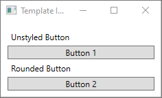
If you run the application, it looks like the following image:
Create a ControlTemplate
The most common way to declare a ControlTemplate is as a resource in the Resources section in a XAML file. Because templates are resources, they follow the same scoping rules as all resources. Where you declare a template affects where you can apply it. For example, if you declare the template in the root element of your application definition XAML file, you can use the template anywhere in your application. If you define the template in a window, only the controls in that window can use the template.
To start, add a Window.Resources element to your MainWindow.xaml file:
Create a new
| Property | Value |
|---|---|
| x:Key | roundbutton |
| TargetType | Button |
This control template is simple:
- a root element for the control, a Grid
- an Ellipse to draw the rounded appearance of the button
- a ContentPresenter to display the user-specified button content
TemplateBinding
When you create a new ControlTemplate, you might still want to use the public properties to change the control's appearance. The TemplateBinding markup extension binds a property of an element that is in the ControlTemplate to a public property that the control defines. When you use a TemplateBinding, you enable properties on the control to act as parameters to the template. When you set a property on a control, the value passes to the element that has the TemplateBinding.
Ellipse
The Fill and Stroke properties of the
ContentPresenter
The template also includes a
In both of the previous examples, the text and the checkbox are set as the Button.Content property. Whatever is set as the content can be presented through a
If you apply the ControlTemplate to a ContentControl type, such as a Button, the template looks for a ContentPresenter in the element tree. If it finds the ContentPresenter, the template automatically binds the control's Content property to the ContentPresenter.
Use the template
Find the buttons that you declared at the start of this article.
Set the second button's Template property to the roundbutton resource:
If you run the project and look at the result, you see that the button has a rounded background.

You might notice that the button isn't a circle but is skewed. Because of the way the

Add a trigger
Even though a button with a template applied looks different, it behaves the same as any other button. If you press the button, the Click event fires. However, you might notice that when you move your mouse over the button, the button's visuals don't change. The template defines these visual interactions.
By using the dynamic event and property systems that WPF provides, you can watch a specific property for a value and then restyle the template when appropriate. In this example, you watch the button's IsMouseOver property. When the mouse is over the control, style the
For this feature to work, you need to add a name to the
Next, add a new Trigger to the ControlTemplate.Triggers collection. The trigger watches the IsMouseOver event for the value true.
Next, add a
Run the project. When you move the mouse over the button, the color of the

Use a VisualState
Visual states are defined and triggered by a control. For example, when you move the mouse over the control, the control triggers the CommonStates.MouseOver state. You can animate property changes based on the current state of the control. In the previous section, you used a AliceBlue when the IsMouseOver property was true. Instead, create a visual state that animates the change of this color, providing a smooth transition. For more information about VisualStates, see Styles and templates in WPF.
To convert the
Next, in the CommonStates. Define two states, Normal and MouseOver.
Apply any animations you define in a
Normal
This state animates the ellipse fill, restoring it to the control's
Backgroundcolor.MouseOver
This state animates the ellipse
Backgroundcolor to a new color:Yellow.
The
Run the project. When you move the mouse over the button, the color of the

Next steps
Collaborate with us on GitHub
The source for this content can be found on GitHub, where you can also create and review issues and pull requests. For more information, see our contributor guide.

.NET Desktop feedback