Note
Access to this page requires authorization. You can try signing in or changing directories.
Access to this page requires authorization. You can try changing directories.
This article highlights the most significant changes in ASP.NET Core in .NET 11 with links to relevant documentation.
This article will be updated as new preview releases are made available.
Blazor
This section describes new features for Blazor.
New DisplayName component and support for [Display] and [DisplayName] attributes
The DisplayName component can be used to display property names from metadata attributes:
[Required, DisplayName("Production Date")]
public DateTime ProductionDate { get; set; }
The [Display] attribute on the model class property is supported:
[Required, Display(Name = "Production Date")]
public DateTime ProductionDate { get; set; }
Of the two approaches, the [Display] attribute is recommended, which makes additional properties available. The [Display] attribute also enables assigning a resource type for localization. When both attributes are present, [Display] takes precedence over [DisplayName]. If neither attribute is present, the component falls back to the property name.
Use the DisplayName component in labels or table headers:
Blazor Web script startup options format now supported for Blazor Server and Blazor WebAssembly scripts
The Blazor Web App script (blazor.web.js) options object passed to Blazor.start() uses the following format since the release of .NET 8:
Blazor.start({
  ssr: { ... },
  circuit: { ... },
  webAssembly: { ... },
});
Now, Blazor Server (blazor.server.js) and Blazor WebAssembly (blazor.webassembly.js) scripts can use the same options format.
The following example shows the prior options format, which remains supported:
Blazor.start({
  loadBootResource: function (...) {
      ...
    },
  });
The newly supported options format for the preceding example:
Blazor.start({
  webAssembly: {
    loadBootResource: function (...) {
      ...
    },
  },
});
For more information, see ASP.NET Core Blazor startup.
New BasePath component
Blazor Web Apps can use the new BasePath component (
Inline JS event handler removed from the NavMenu component
The inline JS event handler that toggles the display of navigation links is no longer present in the NavMenu component of the Blazor Web App project template. Apps generated from the project template now use a collocated JS module approach to show or hide the navigation bar on the rendered page. The new approach improves Content Security Policy (CSP) compliance because it doesn't require the CSP to include an unsafe hash for the inline JS.
To migrate an existing app to .NET 11, including adopting the new JS module approach for the navigation bar toggler, see Migrate from ASP.NET Core in .NET 10 to ASP.NET Core in .NET 11.
NavigateTo and NavLink support for relative navigation
The new RelativeToCurrentUri parameter (default: false) for NavigationManager.NavigateTo and the NavLink component allows you to navigate to URIs relative to the current page path rather than the app's base URI.
Consider the following nested endpoints:
/docs/getting-started/installation/configuration
When the browser's URI is /docs/getting-started/installation and you want to navigate the user to /docs/getting-started/configuration, NavigateTo("/configuration") redirects to /configuration at the app's root instead of the relative path at /docs/getting-started/configuration. Set the RelativeToCurrentUri with NavigateTo or the NavLink component for the desired navigation:
Navigation.NavigateTo("/configuration", new NavigationOptions
{
    RelativeToCurrentUri = true
});
Configuration
Persist temporary data between HTTP requests during static server-side rendering (static SSR)
To persist temporary data between HTTP requests during static server-side rendering (static SSR), Blazor supports TempData. TempData is ideal for scenarios such as flash messages after form submissions, passing data during redirects (POST-Redirect-GET pattern), and one-time notifications.
TempData is available when AddRazorComponents is called in the app's Program file and is provided as a cascading value with the [CascadingParameter] attribute.
[CascadingParameter]
public ITempData? TempData { get; set; }
When supplied to a parameter for simple read/write of a single value, use the [SupplyParameterFromTempData] attribute:
[SupplyParameterFromTempData]
public string? Message { get; set; }
For more information, see ASP.NET Core Blazor server-side state management.
New Blazor Web Worker template (blazorwebworker)
The .NET Web Worker project template, which contains a Web Worker client for offloading long-running work to a background thread, has been renamed to the Blazor Web Worker project template (blazorwebworker). The name change makes it clearer that the template is part of the Blazor stack for use in Blazor WebAssembly and Blazor Web apps (for client-side rendering, CSR).
Two often-requested capabilities have been added to the generated WebWorkerClient:
InvokeVoidAsyncfor fire-and-forget worker calls that don't return a value, mirroring the shape onIJSRuntime.- Cancellation and timeout support on both worker creation and worker invocations, so callers can pass a
CancellationTokenand tear down a stuck worker cleanly.
Existing projects created with the old template continue to work. The rename only affects the template name shown in dotnet new list and in Visual Studio's list of Create a new project templates.
For more information, see the following resources:
- ASP.NET Core Blazor with .NET on Web Workers
- .NET Web Worker template update to Blazor Web Worker template (
dotnet/aspnetcore#66070) (Please don't comment on closed issues and PRs.)
Virtualization enhancements
The Virtualize
component no longer assumes every item has the same height. Previously, the component disabled the browser's native scroll anchoring (to avoid an infinite rendering loop), which meant any height change above the viewport—item expansion, data updates, lazy-loaded content—caused visible items to jump on screen. The Virtualizecomponent now adapts to measured item sizes at runtime, which reduces incorrect spacing and scrolling when item heights vary.The updates use a hybrid approach: native CSS scroll anchoring on browsers that support it for non-
layouts with a manual
ResizeObserver-based scroll-compensation fallback forlayouts and Safari, where native anchoring miscalculates positions on
elements. Apps using the
Virtualizecomponent receive the benefits of these updates automatically. No developer API changes are required.These updates include an update to the default value of Virtualize
.OverscanCount , which was3in .NET 10 or earlier and now changes to15in .NET 11 or later. The change in default value increases the precision of average item height calculations.For more information, see the following resources:
- Item size section and Overscan count section of the Virtualization article.
- [Virtualization] Visible content does not shift when in-DOM items above the viewport change height (
dotnet/aspnetcore#65951) (Please don't comment on closed issues and PRs).
Use the new
AnchorModeparameter to control how the viewport behaves at list edges when items are dynamically added:None: No edge pinning. The viewport stays at the current scroll position regardless of item changes.Start(default): Pins the viewport to the beginning of the list. For example, this pinning behavior is useful for a news feed user experience.End: Pins the viewport to the end of the list. For example, this pinning behavior is useful for a chat or logging user experience.
In the following example, the virtualized content is pinned to the beginning of the list:
... For more information, see the following resources:
- ASP.NET Core Razor component virtualization
- [release/11.0-preview4] Virtualization AnchorMode with variable-height support (
dotnet/aspnetcore#66521) (Please don't comment on closed issues and PRs.)
Content Security Policy (CSP) compliance
The
Virtualizecomponent renders dynamic inlinestyleattributes on its spacer and placeholder elements (for example,style="height: 478896px; flex-shrink: 0;") because spacer heights are calculated at runtime based on scroll position, item count, and average item size, which change on every scroll interaction. These are blocked by a Content Security Policy (CSP) whenstyle-src 'self'is set, breaking virtualization entirely for apps with strict CSP policies.Now, CSP violations are avoided because
Virtualizecomponents:- Render calculated spacer and placeholder heights as numeric values in
data-blazor-virtualize-reserved-heightattributes. - When required, render the trailing spacer's vertical offset as a numeric value in a
data-blazor-virtualize-loop-breaker-transformattribute to hide the spacer.
New service defaults library project template for Blazor WebAssembly apps
The
blazor-wasm-servicedefaultsproject template creates a service defaults library for Blazor WebAssembly apps with Aspire integration. For more information, see Tooling for ASP.NET Core Blazor.New development server for Blazor WebAssembly apps
Microsoft.AspNetCore.Components.Gatewayis a lightweight ASP.NET Core host that replacesMicrosoft.AspNetCore.Components.WebAssembly.DevServerfor serving standalone Blazor WebAssembly apps during development and production.To adopt the Gateway in an existing standalone Blazor WebAssembly app, reference the
Microsoft.AspNetCore.Components.Gatewaypackage in the app's project file.Note
For guidance on adding packages to .NET apps, see the articles under Install and manage packages at Package consumption workflow (NuGet documentation). Confirm correct package versions at NuGet.org.
Custom routing code and middleware aren't required by the app. Fallback endpoints come from the static web assets manifest the SDK emits when the
StaticWebAssetSpaFallbackEnabledproperty is set in the app's project file, which is present by default in standalone Blazor WebAssembly apps created from the project template:true Prior to the release of .NET 11, the
inspectUriproperty of theProperties/launchSettings.jsonfile:- Enables the IDE to detect that the app is a Blazor app.
- Instructs the script debugging infrastructure to connect to the browser through Blazor's debugging proxy.
The property is no longer required when using the new development server.
Open the
Properties/launchSettings.jsonfile of the startup project. Remove theinspectUriproperty in each launch profile of the file'sprofilesnode:- "inspectUri": "..."For more information, see [Blazor] Replace DevServer with BlazorGateway for standalone WASM apps (
dotnet/aspnetcore#65982) (Please don't comment on closed issues and PRs).Server-triggered circuit pause
This feature applies to server-side Blazor apps.
Blazor already supports graceful circuit pause and resume with
Blazor.pauseCircuit()andBlazor.resumeCircuit(). .NET 11 introduces a symmetric server-side pause and resume capability, where the server can request that connected clients begin the graceful circuit-pause flow.Circuit.RequestCircuitPauseAsync(CancellationToken)is used to request that the connected client begin the graceful circuit-pause flow. TheCancellationTokencancels the request before it is accepted by the framework. The method returnstrueif the request was accepted and the client was asked to begin pausing.This feature is useful in the following scenarios:
- Planned shutdowns and deployments.
- Instance draining.
- App maintenance windows.
For more information and an implementation example for server restarts, see ASP.NET Core Blazor server-side state management.
Smaller Blazor WebAssembly publish output
Two trimming changes shrink published Blazor WebAssembly apps that don't use OpenTelemetry (OTEL) or Hot Reload:
- The
ComponentsMetricsandComponentsActivitySourcetypes are now gated behind a[FeatureSwitchDefinition]attribute, so the trimmer can drop the metrics and tracing call paths fromRendererand friends whenSystem.Diagnostics.Metrics.Meter.IsSupportedisfalse(the default for trimmed apps) [browser][wasm] Implement IL trimming for OTEL (dotnet/aspnetcore#65901) (Please don't comment on closed issues and PRs). HotReloadManagernow exposes a feature-switchedIsSupportedproperty tied toSystem.Reflection.Metadata.MetadataUpdater.IsSupported, so the trimmer can eliminate hot-reload caches and metadata-update handler registrations across the renderer when published [blazor][wasm] Fix hot reload IL trimming (dotnet/aspnetcore#65903) (Please don't comment on closed issues and PRs).
Apps that use OTEL or Hot Reload aren't affected by the preceding updates.
QuickGridimprovementsThe
QuickGridcomponent receives several new features in .NET 11.For more information on the following features, see ASP.NET Core Blazor `QuickGrid` component.
Pagination modes
Prior to the release of .NET 11, pagination and sort state is managed in memory inside the
QuickGridcomponent without changing the URL, called inner-state navigation. An interactive render mode is required.With the release of .NET 11,
QuickGridsupports URL-based navigation.Pagination and sort state is persisted in the URL query string. When users paginate or sort, the URL updates (example:
?page=2&sort=Name&direction=asc). This enables link sharing, browser back/forward, and static SSR without interactivity.Sortable column headers and paginator controls render as
elements withhrefattributes. TheStaticHtmlRendererrenders these anchors. On each request, the server reads the query string to determine current page and sort state—no JavaScript runtime required.Query string parameters:
page: One-based page number. The first page omits the parameter for clean URLs.sort: Column title for sorting the grid.direction: Ascending (asc) or descending (desc).
The
sortcolumn is identified by the column'sTitleproperty. Columns without aTitlerender a non-clickableheader.QuickGridreads the URL on initialization and subscribes toNavigationManager.LocationChanged, so browser back/forward and direct URL entry work. When sort parameters are removed from the URL, it falls back to the default sort column/direction.Disabled paginator links use
aria-disabled="true"andpointer-events: noneinstead of the HTMLdisabledattribute, which doesn't exist onelements.Query parameter names
The new
QueryParameterNameOptionsparameter of theQuickGridcomponent controls the names of the query string parameters that persist grid state in the URL. TheQueryParameterNameOptionsclass has three settable properties:Sort: Name of the query string parameter that holds the sort column. The default value issort.Direction: Name of the query string parameter that holds the sort direction. The default value isdirection.Page: Name of the query string parameter that holds the page number. The default value ispage.
The constructor takes an optional prefix argument that's prepended to all three default names. The prefix must include any separator character that you want to appear between the prefix and the name. In the following example, the query string parameters are named
products_sort,products_direction, andproducts_page:@using Microsoft.AspNetCore.Components.QuickGrid... To control the names individually, set the properties of the class. Properties set explicitly take precedence over a prefix passed to the constructor, so the two approaches can be combined:
@using Microsoft.AspNetCore.Components.QuickGrid... @code { private QueryParameterNameOptions queryParameterNames = new() { Sort = "orderBy", Direction = "orderDir", Page = "p" }; }Multiple grids on the same page
Multiple
QuickGridcomponents on the same page require unique query parameter names to avoid query string conflicts. Assign aQueryParameterNameOptionsparameter to all but one of the grids.Each
QuickGridmust have its ownPaginationStateinstance. Multiple grids must not share aPaginationStateif they use different query parameter names—the last grid to render overwrites the query parameter name on the shared state, causing thePaginatorto read from the wrong parameter.In releases prior to .NET 11, the following
QuickGridcomponents worked implicitly:... ... With the release of .NET 11, the following
QuickGridcomponents require unique query parameter names. The firstQuickGriduses the default names, while the second one uses acities_prefix:... ... Example query string for the preceding
QuickGridcomponents:?page=2&sort=Name&direction=asc&cities_page=3&cities_sort=Population&cities_direction=descSort by column
Add
Sortable="true"to aPropertyColumn. With URL-based navigation, selecting a header navigates to a URL with updatedsortanddirectionparameters. With inner-state navigation, selecting a header triggers@onclick, which callsSortByColumnAsync. In both cases,SortByColumnAsyncnavigates viaNavigationManager.NavigateTo(GetSortQueryStringUrl(...)), so the URL always reflects the sort state.Title-based sort identification
Sort state in the URL uses the column's
Titleproperty as the identifier. Thesortquery parameter is set tocolumn.Title(example for column titleName:?sort=Name&direction=asc). On a URL change,QuickGridmatches thesortvalue back to a column by executing_columns.FirstOrDefault(c => c.Title == sort.ColumnTitle). If no column title matches, the sort is ignored and the grid falls back to its default sort.Renaming a column's
Titleis a URL-breaking change. Any bookmarked or shared URLs containing the old title in thesortparameter stop matching, and the grid silently falls back to the default sort instead of sorting by the intended column. ForPropertyColumn, theTitledefaults to the property name (example:Property="@(p => p.FirstName)"producesTitle="First Name"), so renaming the property or explicitly changing theTitleparameter both break existing URLs.Paginator
PaginatorinjectsNavigationManager, subscribes toLocationChanged, and reads the page index from the query string on every location change.GoToPageAsyncnavigates to the target URL rather than directly mutatingPaginationState. State is updated through theLocationChangedcallback flow.GetPageUrlreturns a URL with the one-based page number. Page index 0 (page 1) omits the query parameter entirely.CSS breaking change
When URL-based navigation is enabled, selectors targeting
button.col-titlemust also targeta.col-title, andnav button/nav button:disabledrequirenav a/nav a[aria-disabled="true"]. The built-in QuickGrid stylesheet provides both by default.How to disable URL-based navigation
To disable URL-based navigation, set the
AppContextswitch for the feature tofalse:AppContext.SetSwitch( "Microsoft.AspNetCore.Components.QuickGrid.EnableUrlBasedQuickGridNavigationAndSorting", false);This restores
elements with@onclickhandlers. An interactive render mode is required.The switch only controls the rendered HTML element (
versus). Even when disabled,QuickGridstill reads and writes state to the URL query string internally.SortByColumnAsyncandPaginator.GoToPageAsyncnavigate viaNavigationManager.NavigateToregardless of the flag.Row click event (
OnRowClick)The
QuickGridcomponent now supports row click events through the new OnRowClick parameter. When set, the grid automatically applies appropriate styling (cursor pointer) and invokes the callback with the clicked item:@using Microsoft.AspNetCore.Components.QuickGrid @inject NavigationManager NavigationManagerpeople = new() { new(1, "Alice Smith", "alice@example.com", "Engineering"), new(2, "Bob Johnson", "bob@example.com", "Marketing"), new(3, "Carol Williams", "carol@example.com", "Engineering"), }; private void HandleRowClick(Person person) { NavigationManager.NavigateTo($"/person/{person.Id}"); } private record Person(int Id, string Name, string Email, string Department); } The feature includes built-in CSS styling that applies a pointer cursor to clickable rows through the row-clickable CSS class, providing clear visual feedback to users.
Client-side prerendering in a Blazor Web App preserves the server's culture
By default, client-side prerendering on the server (
.Clientproject in a Blazor Web App) persists the server's CurrentCulture and CurrentUICulture into component state and applies them on the client before satellite assemblies load.Apps that require the client to choose a culture independently of the server can opt out with
WebAssemblyComponentsOptions.UseCultureFromServerin the Blazor Web App'sProgramfile:builder.Services.AddRazorComponents() .AddInteractiveWebAssemblyComponents(options => { options.UseCultureFromServer = false; });Persist session data between HTTP requests during static server-side rendering (static SSR)
Session data persistence reads and writes cookie-based HTTP session values during static server-side rendering (static SSR), which is useful for scenarios such as shopping cart IDs or multi-step form progress. Unlike temporary data persistence (
ITempData), session values aren't cleared after reading. Values persist across multiple requests for the session lifetime.Session storage configuration requires adding services by calling
AddSessionand request pipeline configuration withUseSession:builder.Services.AddDistributedMemoryCache(); builder.Services.AddSession(); builder.Services.AddRazorComponents(); var app = builder.Build(); app.UseSession();When supplied to a parameter, use the
[SupplyParameterFromSession]attribute without or with a key (string):[SupplyParameterFromSession] public string? Message { get; set; } [SupplyParameterFromSession(Name = "flash_message")] public string? FlashMessage { get; set; }For more information, see ASP.NET Core Blazor server-side state management.
GetUriWithFragmentextension methodA new
GetUriWithFragmentextension method permitsNavigationManagerto easily construct URIs with hash fragments. This helper method provides an efficient, zero-allocation way to append hash fragments to the current URI. The following example demonstrates two use cases:- Inline call that jumps to Section 1 (
id="section-1") of the rendered page. - Method call that receives a section Id (
sectionId) and navigates to the section of the page.
@inject NavigationManager Navigation Jump to Section 1 @code { private void NavigateToSection(string sectionId) { var uri = Navigation.GetUriWithFragment(sectionId); Navigation.NavigateTo(uri); } }The method uses
string.Createfor optimal performance and works correctly with non-root base URIs (for example, when usingEnvironmentViewcomponentBlazor now includes a built-in
EnvironmentViewcomponent for conditional rendering based on the hosting environment. This component provides a consistent way to render content based on the current environment across both server-side and client-side hosting models.The
EnvironmentViewcomponent acceptsIncludeandExcludeparameters for specifying environment names. The component performs case-insensitive matching and follows the same semantics as MVC'sEnvironmentTagHelper.@using Microsoft.AspNetCore.Components.WebDebug mode enabledPre-production environment
@DateTime.Now
MathML namespace support
Blazor now supports MathML elements in interactive rendering. MathML elements, such as
,document.createElementNS(), similar to how SVG elements are handled:This fix ensures that MathML content renders correctly in browsers when added dynamically through Blazor's renderer, resolving issues where MathML elements were previously created as regular HTML elements without the proper namespace.
InvokeVoidAsync()analyzerA new Blazor analyzer (BL0010) has been added that recommends using
InvokeVoidAsyncinstead ofInvokeAsyncwhen calling JavaScript functions that don't return values. This analyzer helps developers write more efficient JSInterop code.Problematic code:
// ⚠️ BL0010: Use InvokeVoidAsync for JavaScript functions that don't return a value await JSRuntime.InvokeAsyncRecommended code:
// ✅ Correct: Use InvokeVoidAsync await JSRuntime.InvokeVoidAsync("console.log", "Hello");The analyzer helps catch performance issues where
InvokeAsyncis unnecessarily used withobjector ignored return values, guiding developers toward the more appropriateInvokeVoidAsyncmethod.IComponentPropertyActivatorBlazor now provides
IComponentPropertyActivatorfor customizing how[Inject]properties are populated on components. This enables advanced scenarios such as:- Providing additional context for property resolution.
- Support for custom DI containers that need to intercept property injection.
- Advanced scenarios requiring property injection customization.
public interface IComponentPropertyActivator { ActionThe default implementation caches activators per component type, supports keyed services via
[Inject(Key = "...")], integrates with Hot Reload for cache invalidation, and includes proper trimming annotations for AOT compatibility.SignalR
ConfigureConnectionfor Interactive Server componentsBlazor now provides access to configure the underlying SignalR connection options when using Interactive Server components through the new
ConfigureConnectionproperty onServerComponentsEndpointOptions. This enables configuration ofHttpConnectionDispatcherOptionsproperties that were previously only accessible through workarounds.app.MapRazorComponents() .AddInteractiveServerRenderMode(options => { options.ConfigureConnection = dispatcherOptions => { dispatcherOptions.CloseOnAuthenticationExpiration = true; dispatcherOptions.AllowStatefulReconnects = true; dispatcherOptions.ApplicationMaxBufferSize = 1024 * 1024; }; }); This provides a clean, type-safe API for configuring SignalR connection settings without needing to inspect endpoint metadata.
IHostedServicesupport in Blazor WebAssemblyBlazor WebAssembly now supports
IHostedServicefor running background services in the browser. This brings feature parity with Blazor Server and enables scenarios like periodic data refresh, real-time updates, and background processing.public class DataRefreshService : IHostedService { private Timer? _timer; public Task StartAsync(CancellationToken cancellationToken) { _timer = new Timer(RefreshData, null, TimeSpan.Zero, TimeSpan.FromMinutes(5)); return Task.CompletedTask; } private void RefreshData(object? state) { // Refresh data periodically } public Task StopAsync(CancellationToken cancellationToken) { _timer?.Dispose(); return Task.CompletedTask; } } // Registration builder.Services.AddHostedService(); Hosted services are started when the app starts and stopped when it shuts down, providing a clean lifecycle for background operations in Blazor WebAssembly apps.
Configure Blazor client behavior from the server
Blazor apps can now configure client-side startup behavior from the server in C# when mapping Razor components instead of hand-writing
Blazor.startJavaScript.WithBrowserOptionssets options that the server serializes into the rendered page and the Blazor script applies in the browser, across the Server, WebAssembly, and Auto render modes. The options cover the client log level, interactive Server reconnection, whether enhanced navigation preserves the DOM, and a WebAssembly runtime's environment name, culture, and environment variables:app.MapRazorComponents() .WithBrowserOptions(options => { options.InteractiveServer.ReconnectionDialogId = "reconnect-dialog"; options.InteractiveServer.ReconnectionMaxRetries = 10; options.InteractiveServer.ReconnectionRetryInterval = TimeSpan.FromSeconds(1.5); options.InteractiveWebAssembly.EnvironmentVariables["OTEL_EXPORTER_OTLP_ENDPOINT"] = "https://localhost:4318"; options.StaticServer.CircuitInactivityTimeout = TimeSpan.FromSeconds(1.5); options.StaticServer.PreserveDom = true; options.InteractiveWebAssembly.ApplicationCulture = "en-ca"; options.InteractiveWebAssembly.EnvironmentName = "Staging"; options.LogLevel = LogLevel.Warning; }); You can also set the options in a Razor component with the
ConfigureBrowsercomponent:... @code { private BrowserOptions RequestBrowserOptions => new() { LogLevel = LogLevel.Trace, StaticServer = { PreserveDom = true } }; } Read the resolved options from
HttpContextwithGetBrowserOptions():@BrowserOptions.GetBrowserOptions(HttpContext).LogLevelFor more information, see the following resources:
- API Proposal: BrowserOptions for server-to-client configuration (
dotnet/aspnetcore#66393) - Reshape BrowserConfiguration API per review (BrowserOptions) while preserving the JS wire format (
dotnet/aspnetcore#67337) - Reshape BrowserOptions server-to-client configuration API per review (
dotnet/aspnetcore#67918)
Please don't comment on closed issues and PRs. Open a new issue to provide feedback on this API.
Environment variables in Blazor WebAssembly configuration
Blazor WebAssembly applications can now access environment variables through
IConfiguration. This enables runtime configuration without rebuilding the application, making it easier to deploy the same build to different environments.In the following example, the
API_ENDPOINTandENABLE_FEATURE_Xenvironment variables are automatically included in configuration:var builder = WebAssemblyHostBuilder.CreateDefault(args); var apiEndpoint = builder.Configuration["API_ENDPOINT"]; var featureFlag = builder.Configuration["ENABLE_FEATURE_X"];Environment variables are loaded into the configuration system alongside other configuration sources, such as app settings (
appsettings.json), providing a unified way to access configuration values regardless of their source.Blazor WebAssembly component metrics and tracing
Blazor WebAssembly apps now provide component specific metrics and tracing when support for metrics has been enabled in the runtime.
Enable container support in Blazor Web App template
The Blazor Web App project template now supports the Enable container support option in Visual Studio. This makes it easier to containerize Blazor Web Apps and deploy them to container orchestration platforms, such as Kubernetes or Azure Container Apps.
Static SSR supports client-side validation
Blazor static server-side rendering (static SSR) forms now get instant, in-browser validation feedback without a server round-trip, matching the experience provided by interactive Blazor apps and MVC apps with unobtrusive validation. The .NET model remains the single source of truth for validation rules. The server renders metadata for the validation rules which are then enforced by the Blazor JS code on the client-side.
The feature is enabled by default for all static SSR forms that include the
DataAnnotationsValidatorcomponent. Both enhanced and non-enhanced forms are supported.Complete feature coverage is available in ASP.NET Core Blazor client-side form validation in static SSR.
For more information, see the following resources:
- Add .NET support for client-side validation in Blazor SSR (
dotnet/aspnetcore#66441) - Add JS library for client-side validation in Blazor SSR (
dotnet/aspnetcore#66420)
Please don't comment on closed issues and PRs. If you have feedback on this feature, please open a new issue on the
dotnet/aspnetcoreGitHub repository.Asynchronous form validation support
Blazor forms receive support for async validation rules, such as database lookups or remote API calls. In any rendering mode,
EditFormsubmit validation awaits async validators end-to-end.The built-in
DataAnnotationsValidatorcomponent runs the asynchronousDataAnnotationsAPIs (AsyncValidationAttributeandIAsyncValidatableObject), so asynchronous rules declared on the model work without additional configuration.Validator components register asynchronous work with
ValidationRequestedEventArgs.AddAsyncValidatorfor the whole form andEditContext.RegisterAsyncFieldValidatorfor a single field. The framework owns the cancellation token source, cancels superseded validations, and exposes progress withIsValidationPending(field)andIsValidationFaulted(field).@if (editContext.IsValidationPending(() => model.Username)) { Checking availability... } Complete feature coverage is available in ASP.NET Core Blazor advanced form validation.
For more information, see Add built-in support for async form validation in Blazor (
dotnet/aspnetcore#66526).Please don't comment on closed issues and PRs. If you have feedback on this feature, please open a new issue on the
dotnet/aspnetcoreGitHub repository.Fixes to TempData and
[SupplyParameterFromSession]persistence for streaming SSRWhen a page uses session-backed features, where a component has a
[SupplyParameterFromSession]parameter (which creates a subscription) or the session-storage TempData provider is active, the session cookie (.AspNetCore.Session) is now issued before streaming begins, even if no value is ultimately written. Pages that don't use session-backed features are unaffected.For more information, see Fix TempData and SupplyParameterFromSession persistence for streaming SSR case (
dotnet/aspnetcore#66832). (Please don't comment on closed issues and PRs.)Antiforgery middleware (
app.UseAntiforgery()) optional in Blazor Web AppsCSRF protection is enabled by default via the auto-injected CSRF protection middleware, so an explicit
app.UseAntiforgery()call in a Blazor Web App is usually unnecessary and should only be added for specific use cases. The call no longer appears in apps created from the Blazor Web App project template.For more information, see the following resources:
- Migrate from ASP.NET Core in .NET 10 to ASP.NET Core in .NET 11
- Blazor server-side rendering defers antiforgery validation to middleware (breaking change announcement)
General coverage for the new automatic CSRF protection in ASP.NET Core:
- Prevent Cross-Site Request Forgery (XSRF/CSRF) attacks in ASP.NET Core
- ASP.NET Core Blazor forms overview
- ASP.NET Core Blazor authentication and authorization
Blazor Virtualize can scroll to an item
The
Virtualizecomponent can now open at a specific item and scroll to any item on demand. Two new public APIs make this possible:InitialItemIndexpositions the list at a given item on the first interactive render, so the list opens at that item without a flash of the first item.ScrollToItemAsync(int itemIndex, CancellationToken cancellationToken = default)scrolls to an item at any time after the first render and returns aTaskthat completes when the target is aligned to the top of the viewport.
list = default!; private List products = ProductCatalog.All; private async Task GoToTop() => await list.ScrollToItemAsync(0); } Out-of-range indexes are clamped to the valid range. If a second
ScrollToItemAsynccall starts while one is still in flight, the last call wins. CallingScrollToItemAsyncbefore the first interactive render throwsInvalidOperationException; useInitialItemIndexto set the starting position instead.For more information, see the following resources:
- ASP.NET Core Razor component virtualization
- Add
InitialIndex(sic†) parameter andScrollToIndexAsync(sic†) API toVirtualize(dotnet/aspnetcore#66753). (Please don't comment on closed issues and PRs. sic†: API naming was changed without updating the title of the PR.)
Automatic circuit pause on tab inactivity
Auto-pause can pause a circuit when the browser tab becomes hidden, freeing server memory and SignalR connections held by inactive users. It's an opt-in feature provided by the
Microsoft.AspNetCore.Components.Server.AutoPausepackage. After adding a package reference, enable the feature by callingAddAutoPausewhen the app's root component is mapped:app.MapRazorComponents() .WithBrowserOptions(options => options.AddAutoPause(p => p.HiddenDelay = TimeSpan.FromSeconds(30))); After the tab is hidden for a configurable delay period (default: 2 minutes), the circuit pauses. If the user returns before the delay elapses, the pause doesn't occur.
For more information, see ASP.NET Core Blazor server-side state management.
Wider support for
AuthorizationPolicyandIAuthorizationRequirementDataStarting in .NET 11, you can apply IAuthorizationRequirementData attributes to SignalR hubs and hub methods, MVC controllers and actions, and Blazor's
AuthorizeViewandAuthorizeRouteViewcomponents, not just to endpoints. For apps that target releases earlier than .NET 11, these attributes are only enforced on Minimal API and routed endpoints.For more information, see Custom authorization policies with `IAuthorizationRequirementData`.
QuickGrid APIs from Virtualize are exposed
The following new
QuickGridcomponent APIs are exposed when a grid is virtualized (Virtualize set totrue):InitialItemIndex: Scrolls the grid to the given zero-based row index on the first interactive render. The value is applied once and clamped to the valid range. This forwards to the innerVirtualizecomponent. For more information, see ASP.NET Core Razor component virtualization.ScrollToItemAsync: Programmatically scrolls the grid to the given zero-based row index, aligning it to the top. The last call wins, and the method throws an InvalidOperationException when virtualization is disabled or the grid isn't rendered yet. This forwards to the innerVirtualizecomponent. For more information, see ASP.NET Core Razor component virtualization.AnchorMode: Controls how the viewport behaves at list edges when items are dynamically added (default:Start). This is an experimental API that requires opting in to theASP0030diagnostic, and it forwards to the innerVirtualizecomponent. For more information, see ASP.NET Core Razor component virtualization.ItemComparer: A comparer used to detect whether items were prepended or appended between data loads, which is useful for class-typed items supplied by an ItemsProvider. This is an experimental API that requires opting in to theASP0030diagnostic, and it forwards to the innerVirtualizecomponent. For more information, see ASP.NET Core Razor component virtualization.
For more information, see ASP.NET Core Blazor `QuickGrid` component.
Cache rendered output of a component subtree during static SSR
The new
CacheViewcomponent caches the rendered output of a Razor component subtree during static server-side rendering (static SSR). On a cache hit, cached markup is replayed without instantiating or running the lifecycle of the child components that were included in the cached output.CacheViewis useful for expensive, mostly static sections of a page that don't require the entire response to be cached:For more information, see ASP.NET Core Blazor CacheView component.
Blazor Server circuits update after authentication refresh
Interactive Server components can now receive the refreshed
ClaimsPrincipalwithout reconnecting the circuit. The Blazor component hub and client enable authentication refresh automatically, so no additional configuration is required.After the connection refreshes its authentication, Blazor updates the authentication state and raises
AuthenticationStateChanged. Components that consumeAuthenticationStateProvider, includingAuthorizeView, rerender using the refreshed identity and claims. This behavior is useful when a user's roles or permissions change during an active circuit or when a component should reload user-specific content after claims are refreshed. The UI can reflect the new authentication state without forcing the user to reconnect or reload the page.For more information, see the following resources:
- [Blazor] Propagate SignalR authentication refresh to server circuits (
dotnet/aspnetcore#68221) - [release/11.0-rc1] Harden SignalR authentication refresh (
dotnet/aspnetcore#68593)
Please don't comment on closed issues and PRs. If you have feedback on this feature, please open a new issue on the
dotnet/aspnetcoreGitHub repository.Experimental Blazor AI components for agentic user interfaces
Modern AI apps increasingly provide rich interactions with agents. A complete agentic user interface may need to stream ongoing work, visualize agent reasoning and progress, request approval before tools act, accept multimodal input, and synchronize state between the app and the agent. The Blazor AI components are designed to provide building blocks for creating these experiences using Blazor's component model.
The new
Microsoft.AspNetCore.Components.AINuGet package includes an initial set of Blazor AI components for streaming chat, rich-text and tool rendering, human approval flows, and typed, shared, and predictive UI state.Get started
Important
The
Microsoft.AspNetCore.Components.AIpackage is a prerelease, experimental package throughout .NET 11.Add the package to a Blazor app:
dotnet add package Microsoft.AspNetCore.Components.AI --prereleaseBasic chat and the Components.AI block model work with any
IChatClient. To connect the Blazor app to a remote agent over the Agent User Interaction Protocol (AG-UI), install theAGUI.Clientpackage:dotnet add package AGUI.ClientAGUI.Clientincludes a transitive reference toAGUI.Abstractions, which provides the AG-UI event types used in later examples. Register anAGUIChatClientas the app'sIChatClient:using AGUI.Client; using Microsoft.Extensions.AI; builder.Services.AddHttpClient(httpClient => new AGUIChatClient(new(httpClient, "https://api.example.com/agent"))); AGUIChatClientstreams AG-UI events asChatResponseUpdatevalues. The Blazor AI components render the conversational content from these updates, while apps can use the additional AG-UI event information to build richer agentic interactions. While basic chat functionality is supported with anyIChatClient, AG-UI is required when a remote server and the Blazor client must exchange frontend tool declarations, backend tool events, approval interrupts, shared-state events, or AG-UI conversation identifiers.Microsoft Agent Framework (MAF) can expose an
AIAgentthrough an ASP.NET Core AG-UI endpoint. For the server-side setup, see AG-UI integration with Agent Framework and its .NET getting-started guide.Build a basic streaming conversation
The first step in an agentic UI is often a basic conversation that streams responses and retains message history across turns. The initial chat support is provider- and protocol-neutral. Apps supply an
IChatClientfromMicrosoft.Extensions.AI, andUIAgentconverts its streaming responses into observable content blocks.ChatPageis a complete chat shell that combines three lower-level components:AgentBoundarycreates and cascades the conversation state.MessageListrenders each turn as it streams and provides default typing, error, and retry UI.MessageInputsends messages from a text area and disables input while a response is streaming.
The following component creates a
UIAgentover an app-providedIChatClientand renders the conversation withChatPage:@rendermode InteractiveServer @using Microsoft.AspNetCore.Components.AI @using Microsoft.Extensions.AI @implements IDisposable @inject IChatClient ChatClientAsk the agent a question.
Placeholdersets the hint shown in the empty message input.WelcomeContentsupplies the content shown before the first message is sent.Include the component styles in the
Appcomponent (Components/App.razor):
Render content blocks
An
IChatClientstreams model-facing content, such asTextContent,RichTextContent, andFunctionCallContent, inChatResponseUpdatevalues.UIAgentmaps this response content into UI-facingContentBlockobjects that retain rendering state and can update in place while the response streams. For example, both plain-text fragments and structured rich-text snapshots map to aRichContentBlock.The built-in block types include:
RichContentBlockfor streamed text and structured rich content.FunctionInvocationContentBlockfor a server function call and its eventual result.UIActionBlockfor a function that runs in the Blazor app.FunctionApprovalBlockfor a function call that is waiting for user approval.ActivityContentBlockfor application-defined progress that updates in place.
ChatPageandMessageListinclude default rendering forRichContentBlockandFunctionApprovalBlock. Add aBlockRenderertoChatPage.MessageListContentto replace this default rendering or render another block type. Its child content receives the matching block ascontext, including its current properties as they change during streaming.The following example replaces the default rendering for conversational content:
@block.RawTextUse the renderer's
Whenpredicate to only handle selected blocks of a type. If multiple renderers match, the most recently registered renderer takes precedence. Apps can also define customContentBlocktypes and map response content to them with aContentBlockHandler.Render structured rich text
The rich-text support permits an agent to return a structured presentation model instead of plain text.
RichTextContentis response content that contains both plain text andRichTextNodevalues for headings, paragraphs, emphasis, links, lists, code blocks, tables, and other presentation elements.UIAgentmaps it to the sameRichContentBlockused for plainTextContentbut uses the supplied node tree instead of creating simple paragraphs.Apps can produce
RichTextContentdirectly or useIChatClientmiddleware to transform streamedTextContent, such as by parsing markdown intoRichTextNodevalues. The package doesn't require or include a particular markdown implementation. EachRichTextContentis a complete snapshot, so it atomically replaces the previous content for the same message as streaming progresses.ChatPageandMessageListthen render the structured content without requiring a customBlockRenderer.Render server tool calls
An agent can call a tool that runs on its server while the Blazor app renders the operation using app-specific UI. For example, the agent can call a weather tool, and the app can show the requested location immediately, followed by a weather card when the server returns the result.
Server tool calls become
FunctionInvocationContentBlockinstances, which pair theFunctionCallContentwith its eventualFunctionResultContentand expose the tool name, arguments, and completion state.The package's source generator creates a strongly typed block handler from a class annotated with
ToolBlock,ToolParameter, andToolResult([Blazor] Add Components.AI server tool rendering (dotnet/aspnetcore#68327)):[ToolBlock("get_weather")] public partial class WeatherToolBlock : FunctionInvocationContentBlock { [ToolParameter(Name = "location")] public string? Location { get; set; } [ToolResult] public WeatherInfo? Weather { get; set; } }Register the generated handlers when constructing the
UIAgent:var agent = new UIAgent( chatClient, options => options.AddGeneratedToolBlocks());Render the generated block in
MessageListContent:@if (context.HasResult) { @context.Location: @context.Weather?.Temperature°C
} else {Checking the weather for @context.Location...
}As the call arguments stream, the generated handler updates
LocationwhileHasResultremainsfalse. When the result arrives, it populatesWeather, setsHasResulttotrue, and rerenders the same block as the completed weather card.
When MAF hosts the remote agent, backend tools use its normal tool pipeline and AG-UI transports the call and result to the client. See Backend tool rendering with AG-UI.
Run frontend tools
Frontend tools run in the client app rather than on the agent server. For example, a Blazor app can expose a tool that changes UI state, reads a local preference, or asks the user for input. Create the tool with
AIFunctionFactoryfromMicrosoft.Extensions.AI, then register it withUIAgentOptions.RegisterUIAction([Blazor] Add Components.AI client tool rendering (dotnet/aspnetcore#68325)).RegisterUIActionadvertises theAIFunctionto the agent. When the agent requests it,UIAgentcreates aUIActionBlockinstead of executing the function immediately:var setAccentColor = AIFunctionFactory.Create( async (string color) => { await InvokeAsync(() => { accentColor = color; StateHasChanged(); }); return $"Changed the accent color to {color}."; }, name: "set_accent_color"); var agent = new UIAgent( chatClient, options => options.RegisterUIAction(setAccentColor))Place a
BlockRendererinMessageListContentto handle the function call requested by the agent. For example, the renderer can use a component that automatically invokes the function and displays its progress:The
AutoInvokeActioncomponent callsInvokeAsyncwhen it receives the block:@if (Action.IsComplete) { Accent color updated } else { Updating accent color... } @code { [Parameter, EditorRequired] public UIActionBlock Action { get; set; } = default!; protected override async Task OnInitializedAsync() { if (!Action.IsComplete) { await Action.InvokeAsync(); } } }Calling
InvokeAsyncexecutes the registered function with the arguments supplied by the agent. The function runs wherever the Blazor UI runs: in the server-side circuit for Blazor Server or in the browser for WebAssembly. When the function completes,UIAgentsends its result back to the agent and continues the conversation. Use the renderer'sWhenpredicate to provide different handling for eachaction.ToolName. A renderer can invoke the action automatically, as shown here, or present UI that collects input or confirmation first.Require approval before tools run
An app can require the user to approve a consequential tool call, such as scheduling a meeting, before the agent proceeds. Tool approval requests become
FunctionApprovalBlockinstances. The conversation pauses until the UI callsApproveorReject([Blazor] Add Components.AI human approval flows (dotnet/aspnetcore#68329)):Allow
@approval.ToolNameto run?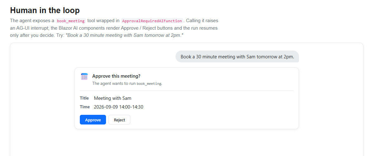
For a MAF agent, the server decides which functions require approval, and AG-UI transports the request and decision. See Human-in-the-loop with AG-UI.
Display activities
An activity is an app-defined progress item that updates in place while an agent performs longer-running work. For example, a research agent can show that it's searching sources, comparing results, and completing the research without adding a separate message for every update.
ActivityHandleris a protocol-neutral extension point that maps provider- or app-specific progress updates into a mutableActivityContentBlock([Blazor] Add agentic generative UI state rendering (dotnet/aspnetcore#68333)).TryCreateBlockinitializes and emits the block for the first matching update.TryUpdateBlockmutates the same block as later updates arrive and indicates when the activity is complete. Register the handler withUIAgentOptions.AddBlockHandler, then provide aBlockRendererfor the app-specific block. Activities don't have a default visual representation.AG-UI's
ACTIVITY_SNAPSHOTandACTIVITY_DELTAevents are one possible source of these updates.AGUIChatClientexposes the original event throughChatResponseUpdate.RawRepresentation. For example, an app can handle replacing snapshots whose payload includes an app-definedcompleteproperty:using System.Text.Json; using Microsoft.AspNetCore.Components.AI; using AGUI.Abstractions; public sealed class ResearchActivityBlock : ActivityContentBlock { public string ActivityMessageId { get; set; } = ""; } public sealed class ResearchActivityHandler : ActivityHandler{ protected override bool TryCreateBlock( BlockMappingContext context, ResearchActivityBlock state) => TryApplySnapshot(context, state, out _); protected override bool TryUpdateBlock( BlockMappingContext context, ResearchActivityBlock state, out bool isCompleted) => TryApplySnapshot(context, state, out isCompleted); private static bool TryApplySnapshot( BlockMappingContext context, ResearchActivityBlock state, out bool isCompleted) { isCompleted = false; if (context.Update.RawRepresentation is not ActivitySnapshotEvent snapshot || (state.ActivityMessageId.Length > 0 && (state.ActivityMessageId != snapshot.MessageId || snapshot.Replace == false))) { return false; } state.ActivityMessageId = snapshot.MessageId; state.ActivityType = snapshot.ActivityType; state.Content = snapshot.Content; isCompleted = snapshot.Content.ValueKind == JsonValueKind.Object && snapshot.Content.TryGetProperty("complete", out var complete) && complete.ValueKind == JsonValueKind.True; context.MarkUpdateHandled(); return true; } } The handler stores the AG-UI message ID on the block to correlate later snapshots. Apps that consume
ActivityDeltaEventinstead apply its RFC 6902 JSON Patch operations to the currentContentbefore returning fromTryUpdateBlock. The app defines the activity payload and completion semantics; Components.AI doesn't include an AG-UI-specific activity handler or JSON Patch implementation.Shared state
Agentic UIs often show a shared workspace alongside the conversation, such as a recipe, document, form, or plan that the agent can update.
UIAgentexposes this data as typed, observable UI state separately from conversational content ([Blazor] Add agentic generative UI state rendering (dotnet/aspnetcore#68333)).The app configures a state mapper for the
ChatResponseUpdatevalues produced by itsIChatClient. In an AG-UI integration, the agent server explicitly maps selected tool results toSTATE_SNAPSHOTorSTATE_DELTAevents.AGUIChatClientthen exposes those events throughChatResponseUpdate.RawRepresentation, where the Blazor app can deserialize them and callSetState:using System.Text.Json; using AGUI.Abstractions; using Microsoft.AspNetCore.Components.AI; var agent = new UIAgent(chatClient, options => { options.StateMapper = context => { if (context.Update.RawRepresentation is StateSnapshotEvent snapshot && snapshot.Snapshot.Deserialize ( JsonSerializerOptions.Web) is { } state) { context.SetState(state); } }; }); Read the current value from
agent.State.Valueand subscribe toagent.State.OnChangedwhen the surrounding component needs to rerender. State mappers can also handle app-specificAIContentfrom otherIChatClientimplementations.
For the corresponding MAF server configuration, including mapping tool results to state snapshots and deltas, see State management with AG-UI.
Show predictive UI state
Predictive state permits an app to render an agent's proposed state change while the model is still generating it without replacing the committed state. For example, as an agent generates the complete contents of an edited document in a tool argument, the UI can progressively display the proposed document and a diff. When generation finishes, the user can accept the completed proposal or reject it and restore the committed document.
An AG-UI server integration can map streamed arguments for a state-writing tool to provisional state events. The completed tool-call arguments are the authoritative proposal. When creating the
UIAgent, configure its state mapper to deserialize those events and callSetPredictiveState.AgentStatethen retains the prior committed value for rollback ([Blazor] Add predictive state updates (dotnet/aspnetcore#68335)):using System.Text.Json; using AGUI.Abstractions; using Microsoft.AspNetCore.Components.AI; var agent = new UIAgent(chatClient, options => { options.StateMapper = context => { if (context.Update.RawRepresentation is StateSnapshotEvent snapshot && snapshot.Snapshot.Deserialize ( JsonSerializerOptions.Web) is { } predictedState) { context.SetPredictiveState(predictedState); } }; options.RegisterUIAction(AIFunctionFactory.Create( ConfirmChanges, name: "confirm_changes", description: "Confirm the proposed document changes.")); }); The example also registers a
confirm_changesfrontend action. When the action appears, a custom block renderer displays the accept and reject controls. The renderer adds the user's choice as theacceptedargument and callsUIActionBlock.InvokeAsync, which runs the registered callback:private string ConfirmChanges(bool accepted) { if (accepted) { agent.State.AcceptPredictiveState(); } else { agent.State.RejectPredictiveState(); } return accepted ? "The user accepted the changes." : "The user rejected the changes."; }The provisional value is immediately available from
agent.State.Value, andHasPendingPredictiveStateindicates that it isn't committed. The callback commits the completed proposal or restores the baseline, and its return value reports the decision to the agent in a follow-up run. If generation fails, is canceled, or ends without a decision, the provisional value is automatically rolled back. The server-side extraction and mapping of streamed tool arguments must be configured explicitly; see State management with AG-UI.
Persist and restore conversations
An
IConversationThreadstores completed turns so a UI can rebuild its conversation after the component or app restarts. A thread can also retain protocol metadata, such as thethreadIdand previousrunIdused to continue a server-owned AG-UI conversation.Pass the thread when constructing
UIAgent, then callUIAgent.RestoreAsyncorAgentContext.RestoreAsyncto explicitly replay the stored updates into content blocks and typed state ([Blazor] Add shared agent and UI state (dotnet/aspnetcore#68334)):var agent = new UIAgent( chatClient, options => options.Thread = conversationThread); var restoredBlocks = await agent.RestoreAsync();Passing a thread to
UIAgentenables new completed turns to be persisted but doesn't automatically restore earlier turns. For MAF-hosted AG-UI agents, see AG-UI conversation continuity.Blazor Hybrid
This section describes new features for Blazor Hybrid.
Release notes appear in this section as preview features become available.
SignalR
This section describes new features for SignalR.
SignalR authentication refresh
SignalR connections can refresh authentication without dropping the connection when the access token expires. The server exposes a
/refreshendpoint alongside/negotiateand reports the token lifetime in the negotiate response. A client re-authenticates before the token expires, so a hub connection that previously closed when its bearer token aged out can stay open.Enable the feature per hub on the server. The server can inspect or reject a refreshed identity by returning a value from
OnAuthenticationRefresh:using System.Security.Claims; app.MapHub("/chat", options => { options.EnableAuthenticationRefresh = true; options.CloseOnAuthenticationExpiration = true; // Optional: inspect the refreshed identity and decide whether to accept it. options.OnAuthenticationRefresh = context => { var previousSubject = context.PreviousUser.FindFirstValue("sub") ?? context.PreviousUser.FindFirstValue(ClaimTypes.NameIdentifier); var newSubject = context.NewUser.FindFirstValue("sub") ?? context.NewUser.FindFirstValue(ClaimTypes.NameIdentifier); return Task.FromResult( previousSubject is not null && string.Equals(previousSubject, newSubject, StringComparison.Ordinal)); }; }); A hub can react to a refreshed identity by overriding
OnAuthenticationRefreshedAsync:public class ChatHub : Hub { public override Task OnAuthenticationRefreshedAsync() { // The connection's User has been updated with the refreshed token. return Task.CompletedTask; } }Automatic refresh is on by default in the .NET client and is configurable with
WithAuthenticationRefresh. Refresh notifications are events on HubConnection, andRefreshAuthenticationAsyncrequests an immediate refresh after the app obtains new claims:await using var connection = new HubConnectionBuilder() .WithUrl("https://example.com/chat") .WithAuthenticationRefresh(options => { // EnableAutoRefresh is true by default. options.RefreshBeforeExpiration = TimeSpan.FromMinutes(1); }) .Build(); connection.AuthenticationRefreshed += context => Task.CompletedTask; connection.AuthenticationRefreshFailed += context => Task.CompletedTask; await connection.StartAsync(); // Refresh immediately after acquiring a token with updated claims. await connection.RefreshAuthenticationAsync();Cancel hub invocations from the client
The SignalR client can cancel a regular, non-streaming hub method invocation. Previously only streaming invocations could be canceled from the client. Now, when you pass a CancellationToken to InvokeAsync and cancel it, the client sends a cancellation message, and the hub method's
CancellationTokenparameter is triggered on the server.// Client — canceling the token cancels the server-side invocation. using var cts = new CancellationTokenSource(); var work = connection.InvokeAsync("LongRunningWork", cts.Token); // ... cts.Cancel();// Hub — accept a CancellationToken to observe client cancellation. public class WorkHub : Hub { public async Task LongRunningWork(CancellationToken cancellationToken) { await Task.Delay(TimeSpan.FromMinutes(5), cancellationToken); } }SignalR .NET client supports authentication refresh after redirects
The SignalR .NET client extends SignalR authentication refresh so it works when negotiate redirects to another server, contributed by @MoChilia. This client change enables support for redirecting servers such as Azure SignalR Service, which hasn't enabled the feature yet.
The client preserves the app-token provider across the redirect, adopts a refreshed transport token from the response, and retains
tokenLifetimeSecondsso automatic refresh remains scheduled after the original token expires.Thank you @MoChilia for this contribution!
SignalR TypeScript client supports authentication refresh
The SignalR TypeScript client supports refreshing an access token without reconnecting. It can schedule a refresh based on the token lifetime that the server reports or refresh immediately after the app obtains updated claims.
Configure automatic refresh by using
withAuthenticationRefresh. Register success and failure handlers on the built connection, and callrefreshAuthenticationto request a manual refresh:const connection = new signalR.HubConnectionBuilder() .withUrl("/clock", { accessTokenFactory: getAccessToken }) .withAuthenticationRefresh({ enableAutoRefresh: true, refreshBeforeExpirationInMilliseconds: 120_000, }) .build(); connection.onAuthenticationRefreshed((context) => { console.log(`New token lifetime: ${context.newTokenLifetimeInSeconds}`); }); connection.onAuthenticationRefreshFailed((context) => { console.error(context.error); }); await connection.start(); // Refresh immediately after acquiring a token with updated claims. await connection.refreshAuthentication();Minimal APIs
This section describes new features for Minimal APIs.
Endpoint filters observe parameter-binding failures
When a Minimal API endpoint has any filters or filter factories configured, the filter pipeline now runs even if parameter binding fails. Filters can read
HttpContext.Response.StatusCode == 400and substitute their own response body.In the
Developmentenvironment, setRouteHandlerOptions.ThrowOnBadRequest = falseso the framework returns a 400 that the filter can observe instead of throwing BadHttpRequestException to the developer exception page. This is already the default in non-Developmentenvironments.Thank you @marcominerva for this contribution!
C# union types
ASP.NET Core supports C# union types (C# language reference), which are new in .NET 11, anywhere
System.Text.Jsonis used: JSON request and response bodies in Minimal APIs and MVC, SignalR'sJsonHubProtocol, Blazor JavaScript interop, persistent component state, and prerendered component parameters.public union UnionIntString(int, string); app.MapGet("/value", () => new UnionIntString(42));Union types aren't supported for non-body binding sources such as route values, query strings, headers, and form fields.
For OpenAPI, an endpoint that returns a union is described with an
anyOfschema listing each case type. Unlike polymorphic types, union cases don't carry a$typediscriminator, so each case reuses its standalone component (for example,#/components/schemas/Dog) instead of a duplicated, prefixed one. ApiExplorer detects a union throughJsonTypeInfoKind.Union, so the schema also flows through to Swashbuckle and NSwag. When multiple cases serialize to the same JSON shape, disambiguate them with a[JsonUnion]classifier. SignalR unions require the JSON hub protocol; the MessagePack andNewtonsoft.Jsonprotocols don't support unions.For examples and additional information that apply to Blazor apps, see the Component parameters section in the Components overview article and the Pass parameters section of the Dynamically-rendered ASP.NET Core Razor components article.
Async validation for Minimal APIs
Minimal API validation now supports asynchronous validators end-to-end (dotnet/aspnetcore #66487, dotnet/aspnetcore #67183). Preview 5 shipped the building blocks for asynchronous form validation in Blazor. Preview 6 adds new asynchronous
DataAnnotationsAPIs in the base libraries (AsyncValidationAttributeandIAsyncValidatableObject), andMicrosoft.Extensions.Validationnow runs them when an endpoint validates a request.The simplest way to add an asynchronous rule is a custom validation attribute. Derive from
AsyncValidationAttributeand implementIsValidAsyncto query a database or call a remote API without blocking a thread. The synchronousIsValidis abstract too; throw from it when the attribute validates asynchronously only:using System.ComponentModel.DataAnnotations; using Microsoft.Extensions.DependencyInjection; public sealed class UniqueEmailAttribute : AsyncValidationAttribute { // Synchronous IsValid. This attribute validates asynchronously only. protected override ValidationResult? IsValid(object? value, ValidationContext context) => throw new InvalidOperationException("Validate this attribute with IsValidAsync."); protected override async Task(); if (value is string email && await users.EmailExistsAsync(email, cancellationToken)) { return new ValidationResult("That email is already registered."); } return ValidationResult.Success; } } Apply
[UniqueEmail]to a property like any built-in validation attribute.For validation that spans several properties or the whole object, implement
IAsyncValidatableObjectand return results as anIAsyncEnumerable. BecauseIAsyncValidatableObjectextendsIValidatableObject, also implement the synchronousValidatemethod. When a type validates asynchronously only, throw fromValidateso its validation isn't silently skipped by the synchronous APIs:using System.ComponentModel.DataAnnotations; using System.Runtime.CompilerServices; public class ReservationRequest : IAsyncValidatableObject { [Required] public string Email { get; set; } = ""; public DateOnly Date { get; set; } // Synchronous IValidatableObject. This type validates asynchronously only. public IEnumerableValidate(ValidationContext context) => throw new InvalidOperationException("Validate this type with ValidateAsync."); public async IAsyncEnumerable ValidateAsync( ValidationContext context, [EnumeratorCancellation] CancellationToken cancellationToken = default) { var rooms = context.GetRequiredService (); if (!await rooms.HasAvailabilityAsync(Date, cancellationToken)) { yield return new ValidationResult( "No rooms are available on that date.", [nameof(Date)]); } } } Register validation and the framework validates the request before the endpoint runs:
builder.Services.AddValidation(); app.MapPost("/reservations", (ReservationRequest request) => Results.Ok(request));Validators run concurrently where possible: asynchronous attributes on the same member start together, collection items validate in parallel, and the framework preserves the existing ordering between member, type, and
IValidatableObjectvalidation.Short-circuit endpoints with an attribute
The new
[ShortCircuit]attribute marks an endpoint to run immediately after routing, skipping the rest of the middleware pipeline. This is the attribute form of the existingShortCircuit()endpoint convention, so it can be applied directly to MVC controllers and actions.Short-circuiting is useful for endpoints that don't need authentication, CORS, or other middleware—for example a health check or a
robots.txtresponse, and it avoids the cost of running that middleware. The endpoint still runs and produces its response. Pass an optional status code, such as[ShortCircuit(404)], to set the response status code.[ApiController] [Route("robots.txt")] [ShortCircuit] public class RobotsController : ControllerBase { [HttpGet] public IActionResult Get() => Content("User-agent: *\nDisallow:", "text/plain"); }The same attribute works on Minimal API endpoints, and the existing
ShortCircuit()convention continues to work unchanged:app.MapGet("/health", [ShortCircuit] () => "Healthy");Thank you @Porozhniakov for contributing this feature!
Validation localization is built in
Microsoft.Extensions.Validationlocalizes validation messages and display names without a separate package. CallingAddLocalizationto register anIStringLocalizerFactory, followed byAddValidation, activates localization automatically. The validation source generator emits the localization lookup into your assembly.builder.Services.AddLocalization(); builder.Services.AddValidation();[ValidatableType] public class CustomerModel { [Display(Name = "CustomerName")] // resource key for the display name [Required(ErrorMessage = "NameRequired")] // resource key for the message public string? Name { get; set; } }By default, keys resolve against the resources of the type that declares the validated member. An explicit
ErrorMessagevalue, such asNameRequiredin the preceding example, is the first resource key that localization tries. When an attribute doesn't specifyErrorMessage, localization instead tries built-in resource-name conventions from most to least specific:{DeclaringType}_{MemberName}_{AttributeType}_Error{DeclaringType}_{AttributeType}_Error{AttributeType}_Error
For example, a
[Required]attribute onCustomerModel.Nameresolves againstCustomerModel_Name_RequiredAttribute_Error,CustomerModel_RequiredAttribute_Error, or the sharedRequiredAttribute_Errorresource. This allows the default message of an attribute to be translated once for the whole app. If no resource resolves, validation falls back to the attribute's built-in message. UseValidationOptions.LocalizerProviderto resolve keys from a shared resource file instead:builder.Services.AddValidation(options => { options.LocalizerProvider = (_, factory) => factory.Create(typeof(ValidationMessages)); });Localized strings don't have to come from resource files. Registering a custom
IStringLocalizerFactoryswitches validation messages to that factory's backing store, such as a database or JSON files. A user-registered factory takes precedence over the default resource file implementation:builder.Services.AddSingletonAttributes that already localize themselves (
ErrorMessageResourceType,[Display(ResourceType = ...)]) bypass the pipeline entirely. A custom attribute that needs to substitute its own values into the message template can implementIValidationMessageFormatter:public sealed class DivisibleByAttribute : ValidationAttribute, IValidationMessageFormatter { public int Divisor { get; init; } public string FormatMessage(CultureInfo culture, string template, string displayName) => string.Format(culture, template, displayName, Divisor); // {0} = name, {1} = divisor }The same localization rules apply to validation for minimal APIs and Blazor, so a message localizes identically wherever the model is used.
Complete feature coverage is available in the following articles:
For more information, see Add localization support to Microsoft.Extensions.Validation (
dotnet/aspnetcore#66646).Validation attributes are no longer experimental
The ValidatableTypeAttribute and SkipValidationAttribute attributes from the
Microsoft.Extensions.ValidationNuGet package are no longer marked experimental. If you suppressedASP0029to use either attribute, remove the suppression.For more information, see the following resources:
OpenAPI
This section describes new features for OpenAPI.
Describe binary file responses
ASP.NET Core 11 introduces support for generating OpenAPI descriptions for operations that return binary file responses. This support maps the
FileContentResultresult type to an OpenAPI schema withtype: stringandformat: binary.Use the
Producesextension method withTofFileContentResultto specify the response type and content type:app.MapPost("/filecontentresult", () => { var content = "This endpoint returns a FileContentResult!"u8.ToArray(); return TypedResults.File(content); }) .Produces(contentType: MediaTypeNames.Application.Octet); The generated OpenAPI document describes the endpoint response as:
responses: '200': description: OK content: application/octet-stream: schema: $ref: '#/components/schemas/FileContentResult'The
FileContentResultis defined incomponents/schemasas:components: schemas: FileContentResult: type: string format: binaryOpenAPI 3.2.0 support (Breaking Change)
Microsoft.AspNetCore.OpenApinow supports OpenAPI 3.2.0 through an updated dependency onMicrosoft.OpenApi3.3.1. This update includes breaking changes from the underlying library. For more information, see the Microsoft.OpenApi upgrade guide.To generate an OpenAPI 3.2.0 document, specify the version when calling AddOpenApi:
builder.Services.AddOpenApi(options => { options.OpenApiVersion = Microsoft.OpenApi.OpenApiSpecVersion.OpenApi3_2; });Subsequent updates take advantage of new capabilities in the 3.2.0 specification, such as item schema support for streaming events.
Thank you @baywet for this contribution!
HTTP QUERY in generated OpenAPI documents
OpenAPI document generation now recognizes HTTP QUERY as a known operation type. QUERY is a proposed safe, idempotent method that lets clients send a request body when describing a search, useful when a query is too large or too structured to fit in a URL. Routing already accepts arbitrary verb strings via
MapMethods, and OpenAPI 3.2 adds aqueryfield to the Path Item Object so this can be described in the OpenAPI document.Note that
queryis only valid in an OpenAPI 3.2 document, so set theOpenApiVersionin theOpenApiOptions. In earlier OpenAPI versions, thequeryoperation is generated within anx-oai-additionalOperationsspecification extension in the Path Item Object.using Microsoft.OpenApi; var builder = WebApplication.CreateBuilder(args); builder.Services.AddOpenApi(options => { options.OpenApiVersion = OpenApiSpecVersion.OpenApi3_2; }); var app = builder.Build(); app.MapOpenApi(); app.MapMethods("/search", ["QUERY"], (SearchRequest request) => SearchService.Run(request)); app.Run();In an OpenAPI 3.2 document, the QUERY operation is described inline as a sibling of
get,post, and other standard operations:"paths": { "/search": { "query": { "requestBody": { ... }, "responses": { "200": { ... } } } } }In OpenAPI 3.0 and 3.1 documents, the same operation is represented under the
x-oai-additionalOperationsextension on the Path Item:"paths": { "/search": { "x-oai-additionalOperations": { "QUERY": { "requestBody": { ... }, "responses": { "200": { ... } } } } } }Thank you @kilifu for this contribution!
File stream result types appear in OpenAPI documents
FileStreamResult,FileContentHttpResult, andFileStreamHttpResultare now described as binary string schemas in generated OpenAPI documents, so clients see accurate response shapes for endpoints that stream files. Annotate the endpoint with.Produces(or the equivalent(contentType: "application/pdf") FileStreamHttpResult/FileStreamResulttype) so OpenAPI sees the result type and emits the binary schema.Thank you @marcominerva for this contribution!
OpenAPI schemas better match ASP.NET Core behavior
OpenAPI generation now handles several schema cases more accurately. Non-body enum parameters keep the original C# enum member names even when HTTP JSON options configure a JsonStringEnumConverter naming policy, because query, route, header, and form binding use
Enum.TryParserather than JSON serialization. Array schema reference IDs now use valid component names such asstringArrayandTodoArrayinstead of names with array syntax.builder.Services.ConfigureHttpJsonOptions(options => { options.SerializerOptions.Converters.Add( new JsonStringEnumConverter(JsonNamingPolicy.KebabCaseLower)); }); app.MapGet("/orders", (OrderStatus status) => Results.Ok(status));With this configuration, a body schema can still describe
OrderStatus.PendingReviewaspending-review, while the query parameter schema describes the accepted value asPendingReview.Minimal API endpoints can support multiple Produces extension method calls for the same status code—for example, to specify that a 200 response may arrive as
application/jsonortext/plainwith different schemas. The same support applies to MVC controllers via multiple[ProducesResponseType]attributes.In prior releases, the framework collapsed each status code to a single response type and silently dropped the rest, making it impossible to describe endpoints that serve multiple content types. Microsoft.AspNetCore.Mvc.ApiExplorer now preserves every declared response type with deterministic ordering, and the generated OpenAPI document emits separate content entries per media type—or an
anyOfschema when multiple types share the same content type.Thank you @marcominerva for the array schema reference contribution!
OpenAPI 3.2 by default
Generated OpenAPI documents now target OpenAPI 3.2 by default. Documents continue to generate as before. Set the document version explicitly if you need to target an earlier version for tooling that doesn't yet support OpenAPI 3.2.
To target an earlier version, specify it when calling AddOpenApi:
builder.Services.AddOpenApi(options => { options.OpenApiVersion = Microsoft.OpenApi.OpenApiSpecVersion.OpenApi3_1; });Server-Sent Events support in OpenAPI 3.2
Endpoints that return
SseItemare described in the generated OpenAPI document with the OpenAPI 3.2itemSchemashape fortext/event-streamresponses. TheitemSchemadescribes a stream's per-event payload shape instead of falling back to a plainstringschema.app.MapGet("/todos/stream", (CancellationToken ct) => TypedResults.ServerSentEvents(GetTodosAsync(ct))) .WithName("StreamTodos"); static async IAsyncEnumerable(todo) { EventId = todo.Id.ToString() }; await Task.Delay(1000, ct); } } Return the stream through
TypedResults.ServerSentEvents. A handler that returnsIAsyncEnumerabledirectly is serialized as JSON instead of SSE. Use the dedicatedSseItemoverload withouteventType. To use one event name for the whole stream, pass a plainIAsyncEnumerablewitheventType.The generated 3.2 document describes the event payload with
itemSchemareferencing#/components/schemas/Todo, plus the standard SSEeventandidstring fields:responses: '200': description: OK content: text/event-stream: itemSchema: type: object required: [data] properties: data: $ref: '#/components/schemas/Todo' event: { type: string } id: { type: string }If the event payload is a discriminated union (a preview C# 14 feature), OpenAPI also emits the union's case names as an
enumon theeventfield.Select an environment for build-time OpenAPI document generation
Build-time OpenAPI document generation supports selecting the app environment with the
OpenApiGenerationEnvironmentMSBuild property. The property sets the host's environment for the generation process, equivalent to setting theASPNETCORE_ENVIRONMENTorDOTNET_ENVIRONMENTenvironment variable. Environment-specific configuration and document transformations can therefore affect the generated OpenAPI document without requiring the environment variable to be set before runningdotnet build.Set the property in the project file:
Development For more information, see Generate OpenAPI documents.
Thank you @ldsenow for this contribution!
OpenAPI reflects obsolete APIs
ASP.NET Core OpenAPI generation maps
[Obsolete]todeprecated: trueautomatically for operations, schema types, and schema properties. API clients and documentation tools can therefore surface the same deprecation information as .NET callers without a custom OpenAPI transformer.app.MapGet("/catalog/{id}", GetCatalogItem); #pragma warning disable CS0618 // This example intentionally declares and maps obsolete APIs. app.MapGet("/catalog/legacy/{id}", GetLegacyCatalogItem); [Obsolete("Use /catalog/{id}.")] static LegacyCatalogItem GetLegacyCatalogItem(int id) => new(id, $"Product {id}", $"SKU-{id:D4}"); static CatalogItem GetCatalogItem(int id) => new(id, $"Product {id}", $"SKU-{id:D4}"); public sealed record CatalogItem( int Id, string Name, string StockKeepingUnit); [Obsolete("Use CatalogItem.")] public sealed record LegacyCatalogItem( int Id, string Name, [property: Obsolete("Use StockKeepingUnit.")] string Sku); #pragma warning restore CS0618The generated document marks the legacy operation, its response schema, and the
Skuproperty as deprecated:{ "paths": { "/catalog/legacy/{id}": { "get": { "deprecated": true } } }, "components": { "schemas": { "LegacyCatalogItem": { "deprecated": true, "properties": { "sku": { "deprecated": true } } } } } }An IOpenApiOperationTransformer or IOpenApiSchemaTransformer can override the generated value for a specific API.
Thank you @fickleEfrit for this contribution!
Authentication and authorization
This section describes new features for authentication and authorization.
TimeProvidersupport in ASP.NET Core IdentityASP.NET Core Identity now uses
TimeProviderinstead ofDateTimeandDateTimeOffsetfor all time-related operations. This change makes Identity components more testable and provides better control over time in tests and specialized scenarios.The following example shows how to use a fake
TimeProviderfor testing Identity features:// In tests var fakeTimeProvider = new FakeTimeProvider( new DateTimeOffset(2024, 1, 1, 0, 0, 0, TimeSpan.Zero)); services.AddSingleton(fakeTimeProvider); services.AddIdentity By using
TimeProvider, you can more easily write deterministic tests for time-sensitive Identity features such as token expiration, lockout durations, and security stamp validation.Infer passkey display name from authenticator
ASP.NET Core Identity now automatically infers friendly display names for passkeys based on their AAGUID (Authenticator Attestation GUID). Built-in mappings are included for the most commonly used passkey authenticators, including Google Password Manager, iCloud Keychain, Windows Hello, 1Password, and Bitwarden.
For known authenticators, the name is automatically assigned without prompting the user. For unknown authenticators, the user is redirected to a rename page. Extend the mappings by adding entries to the
PasskeyAuthenticatorsdictionary in the project.dotnet user-jwtssupports file-based appsThe
dotnet user-jwtstool creates signed development JWTs so you can call an app's authenticated endpoints without setting up a real identity provider. Thecreatecommand generates a token, stores its signing key in the app's user secrets, and prints the token to use as a bearer token. It now works with file-based apps (a singleapp.cswith no project file) through the new--fileoption:dotnet user-jwts create --file app.csConsistent authorization metadata across the stack
Authorization metadata can be expressed as IAuthorizeData, an AuthorizationPolicy, or an IAuthorizationRequirementData attribute. MVC filters, SignalR hub methods, and Blazor's
AuthorizeViewandAuthorizeRouteViewapply all three forms consistently.A new
AuthorizationPolicy.CombineAsyncoverload is the shared implementation:public class AuthorizationPolicy { public static TaskMVC, SignalR, and Blazor use this overload internally. A custom attribute that implements both IAuthorizeData and IAuthorizationRequirementData contributes to the decision once. The legacy MVC path with
EnableEndpointRouting = falseis unchanged.Negotiate authentication uses TLS channel binding
Negotiate authentication on Kestrel uses the TLS endpoint channel binding token for HTTPS connections. The authentication handler supplies the token to the underlying Kerberos or NTLM exchange and retains it across multi-round authentication.
No configuration changes are required. Non-HTTPS connections and HTTPS connections where a channel binding token isn't available continue to use the existing behavior.
Experimental Device Bound Session Credentials support
Important
The
Microsoft.AspNetCore.Authentication.DeviceBoundSessionspackage is experimental and remains prerelease throughout .NET 11 and until the specification stabilizes.The Device Bound Session Credentials (DBSC) specification defines a protocol that binds session refresh to a private key held by the browser. The app issues a short-lived session cookie, and the browser must provide a signed proof of possession to refresh it. A copied session cookie might remain usable until it expires, but an attacker without the device key can't use it to extend the session.
ASP.NET Core adds an experimental server-side DBSC implementation in the
Microsoft.AspNetCore.Authentication.DeviceBoundSessionspackage. The authentication component layers over an existing cookie authentication scheme and manages the registration and refresh endpoints, a path-scoped refresh cookie, and the short-lived session cookie.After adding the
Microsoft.AspNetCore.Authentication.DeviceBoundSessionspackage, configure DBSC over an existing cookie authentication scheme:builder.Services .AddAuthentication("Application") .AddCookie("Application") .AddDeviceBoundSession("Application", options => { options.ShortLivedCookieExpiration = TimeSpan.FromMinutes(10); });Browser support currently requires an experimental DBSC implementation. For more information, see Chrome's DBSC documentation.
Miscellaneous
This section describes miscellaneous new features in .NET 11.
IOutputCachePolicyProviderinterfaceASP.NET Core in .NET 11 provides the IOutputCachePolicyProvider interface for implementing custom output caching policy selection logic. By using this interface, apps can determine the default base caching policy, check for the existence of named policies, and support advanced scenarios where policies must be resolved dynamically. Examples include loading policies from external configuration sources, databases, or applying tenant-specific caching rules.
The following code shows the
IOutputCachePolicyProviderinterface:public interface IOutputCachePolicyProvider { IReadOnlyListGetBasePolicies(); ValueTask Thank you @lqlive for this contribution!
Auto-trust development certificates in WSL
The development certificate setup now automatically trusts certificates in WSL (Windows Subsystem for Linux) environments. When you run
dotnet dev-certs https --trustin WSL, the certificate is automatically installed and trusted in both the WSL environment and Windows, eliminating manual trust configuration.# Automatically trusts certificates in both WSL and Windows dotnet dev-certs https --trustThis improvement streamlines the development experience when using WSL, removing a common friction point for developers working in Linux environments on Windows.
Thank you @StickFun for this contribution!
Native OpenTelemetry tracing for ASP.NET Core
ASP.NET Core now natively adds OpenTelemetry semantic convention attributes to the HTTP server activity, aligning with the OpenTelemetry HTTP server span specification. All required attributes are included by default, matching the metadata previously only available through the
OpenTelemetry.Instrumentation.AspNetCorelibrary.To collect the built-in tracing data, subscribe to the
Microsoft.AspNetCoreactivity source in your OpenTelemetry configuration:builder.Services.AddOpenTelemetry() .WithTracing(tracing => tracing .AddSource("Microsoft.AspNetCore") .AddConsoleExporter());No additional instrumentation library (such as
OpenTelemetry.Instrumentation.AspNetCore) is needed. The framework now directly populates semantic convention attributes on the request activity, such ashttp.request.method,url.path,http.response.status_code, andserver.address.If you don't want OpenTelemetry attributes added to the activity, you can turn it off by setting the
Microsoft.AspNetCore.Hosting.SuppressActivityOpenTelemetryDataAppContext switch totrue.Performance improvements
Kestrel's HTTP/1.1 request parser now uses a non-throwing code path for handling malformed requests. Instead of throwing BadHttpRequestException on every parse failure, the parser returns a result struct indicating success, incomplete, or error states. In scenarios with many malformed requests — such as port scanning, malicious traffic, or misconfigured clients — this eliminates expensive exception handling overhead and improves throughput by up to 20-40%. There's no impact on valid request processing.
The HTTP logging middleware now pools its
ResponseBufferingStreaminstances, reducing per-request allocations when response body logging or interceptors are enabled.Zstandard response compression and request decompression
ASP.NET Core now supports Zstandard (zstd) for both response compression and request decompression. This adds zstd support to the existing response-compression and request-decompression middleware and enables zstd by default.
var builder = WebApplication.CreateBuilder(args); builder.Services.AddResponseCompression(); builder.Services.AddRequestDecompression(); builder.Services.Configure(options => { options.CompressionOptions = new ZstandardCompressionOptions { Quality = 6 // 1-22, higher = better compression, slower }; }); Thank you @manandre for this contribution!
HTTP/3 starts processing requests earlier
Kestrel now starts processing HTTP/3 requests without waiting for the control stream and SETTINGS frame first, which reduces first-request latency on new connections.
MCP Server template ships with the .NET SDK
The Model Context Protocol (MCP) is an open standard that AI applications and agents, such as those in Visual Studio, Visual Studio Code, and GitHub Copilot, use to discover and call external tools, data, and services through a consistent interface. An MCP server exposes your own functionality, such as custom tools or access to a data source, so an AI host can invoke it on the user's behalf.
Use the
mcpservertemplate when you want to build a C# MCP server that integrates your code or services with AI-powered tools. The generated project uses the official C# SDK for MCP and includes a working sample tool, so you have a runnable starting point to extend with your own tools.The
mcpserverproject template, previously available only by installingMicrosoft.McpServer.ProjectTemplates, now ships as a bundled template in the .NET SDK:dotnet new mcpserver -o MyMcpServerMoving the template into ASP.NET Core makes it discoverable from
dotnet new listwithout a separate install step, and aligns its servicing with the rest of the web stack.For more information, see Build a Model Context Protocol (MCP) server in C#.
TLS handshake observability in Kestrel
Two related changes make it easier to diagnose and customize TLS connections in Kestrel.
ITlsHandshakeFeaturenow exposes anExceptionproperty containing the exception thrown during a failed TLS handshake, so middleware and logging can record why a connection failed instead of seeing a bareIOExceptionfurther up the stack. The feature continues to work after the handshake fails — Kestrel snapshots the relevant fields off the underlyingSslStreambefore it is disposed.The
TlsClientHelloBytesCallbackoption onHttpsConnectionAdapterOptionswas reworked as a connection middleware. The previous callback shape is now obsolete; configure ClientHello inspection via the newListenOptions.UseTlsClientHelloListenerextension instead. The example below uses both features together — connection middleware readsITlsHandshakeFeature.Exceptionafter the handshake, andUseTlsClientHelloListenerinspects the ClientHello before TLS:var builder = WebApplication.CreateBuilder(args); builder.WebHost.ConfigureKestrel(options => { options.ListenAnyIP(5001, listenOptions => { listenOptions.Use(next => async context => { await next(context); var tlsHandshakeFeature = context.Features.Get(); if (tlsHandshakeFeature?.Exception is { } ex) { Console.WriteLine($"[TLS Handshake Failed] ConnectionId={context.ConnectionId}, Exception={ex.GetType().Name}: {ex.Message}"); } }); // UseTlsClientHelloListener must be called before UseHttps() listenOptions.UseTlsClientHelloListener((connection, clientHelloBytes) => { Console.WriteLine($"TLS Client Hello received on {connection.ConnectionId}, {clientHelloBytes.Length} bytes"); }); listenOptions.UseHttps(); }); }); Response compression always emits
Vary: Accept-EncodingThe response-compression middleware now adds
Vary: Accept-Encodingto every response when compression is enabled, even when the response itself isn't compressed. This prevents shared caches and CDNs from serving a compressed payload to a client that didn't ask for one (or vice versa).Thank you @pedrobsaila for this contribution!
Runtime-async enabled for shared framework libraries
ASP.NET Core's shared-framework-only libraries are now compiled with the
runtime-asyncfeature onnet11.0+. Runtime-async lets the runtime, rather than the C# compiler, generate the state machine forasync/await, which can reduce per-await allocations and improve diagnostics. This is an internal codegen change with no public API impact — apps targetingnet11.0automatically benefit when they call into the affected ASP.NET Core libraries.Libraries that ship as both shared-framework members and standalone NuGet packages are excluded, because runtime-async is incompatible with WebAssembly and would otherwise break Wasm consumers of those packages.
Because runtime-async changes how
async/awaitis generated for a large portion of the ASP.NET Core stack, try your apps against this preview and file an issue if you hit unexpected behavior, particularly around exception stacks,ExecutionContext/AsyncLocalflow, or anything that looks like a regression from .NET 10.Rate-limiting middleware returns accurate
Retry-AfterheadersThe FixedWindowRateLimiter now reports a RetryAfter metadata value that accurately reflects the next window boundary. Apps that propagate this metadata to the
Retry-Afterresponse header in their OnRejected callback now produce correct retry intervals automatically, with no code changes required.Additional fixes in
System.Threading.RateLimitingresolve an issue where TokenBucketRateLimiter mishandled partial token refills during zero-permit acquisition, and improve the chained rate limiter returned by CreateChained to correctly forward idle-duration and replenishment behavior from its inner limiters.For an overview of the rate limiting middleware, see Rate limiting middleware in ASP.NET Core.
Thank you @asbjornvad and @apoorvdarshan for these contributions!
Kestrel applies trailer header timeouts
Kestrel now applies RequestHeadersTimeout to fragmented HTTP/2 and HTTP/3 trailer headers that don't finish sending the header block. The same timeout that protects initial request headers now also prevents connections from staying open indefinitely while Kestrel waits for trailer
HEADERSframes to complete.builder.WebHost.ConfigureKestrel(options => { options.Limits.RequestHeadersTimeout = TimeSpan.FromSeconds(10); });TLS channel-binding token access from
ITlsConnectionFeatureApplications using TLS can read the connection's channel binding token to defend against relay attacks:
using System.Security.Authentication.ExtendedProtection; app.Use(async (context, next) => { var tls = context.Features.Get(); if (tls is not null && tls.TryGetChannelBindingBytes( ChannelBindingKind.Endpoint, out ReadOnlyMemory cbt)) { // Compare cbt against the token the client presented during authentication. } await next(context); }); Kestrel returns the binding from
SslStream.TransportContext.GetChannelBinding. IIS and HTTP.sys return it from the request. On HTTP.sys,HttpSysOptions.HttpAuthenticationHardeningLevelcontrols Extended Protection and channel-binding token exposure:Legacydisables channel-binding validation and doesn't expose the token.Medium, the default, exposes the token and validates it when supplied, but tolerates its absence.Strictrequires the token for authenticated requests and rejects requests without one. It also fails startup if the OS can't apply the configuration, whileLegacyandMediumlog the configuration failure and continue.
Breaking changes
Use the articles in Breaking changes in .NET to find breaking changes that might apply when upgrading an app to a newer version of .NET.
Collaborate with us on GitHubThe source for this content can be found on GitHub, where you can also create and review issues and pull requests. For more information, see our contributor guide.ASP.NET Core
Additional resources