AdaBoost Machine Learning Algorithm: How to Improve Performance of Hard to Predict Cases
An intuitive explanation of the Adaptive Boosting algorithm and its difference from other Decision Tree based Machine Learning algorithms
Machine Learning

Intro
The number of Machine Learning algorithms keeps increasing with time. If you want to be a successful Data Scientist, you must understand how they differ from one another.
This story is part of a series where I provide an in-depth look at different algorithms, how they work, and how to build them in Python.
The story covers the following topics:
The category of algorithms AdaBoost belongs to
Visual comparison of model predictions between a Single Decision Tree, Random Forest, and AdaBoost.
Explanation of how AdaBoost differs from other algorithms
Python code examples
What category of algorithms does AdaBoost belong to?
AdaBoost, same as its other tree-based algorithm "friends," belongs to the supervised branch of Machine Learning. While it can be used for both classification and regression problems, I focus on the classification side in this story.
Side note, I have put Neural Networks in a category of their own due to their unique approach to Machine Learning. However, they can be used to solve a wide range of problems, including but not limited to classification and regression. The below chart is interactive so make sure to click👇 on different categories to enlarge and reveal more.
If you enjoy Data Science and Machine Learning, please subscribe to get an email whenever I publish a new story.
Decision Tree vs. Random Forest vs. AdaBoost
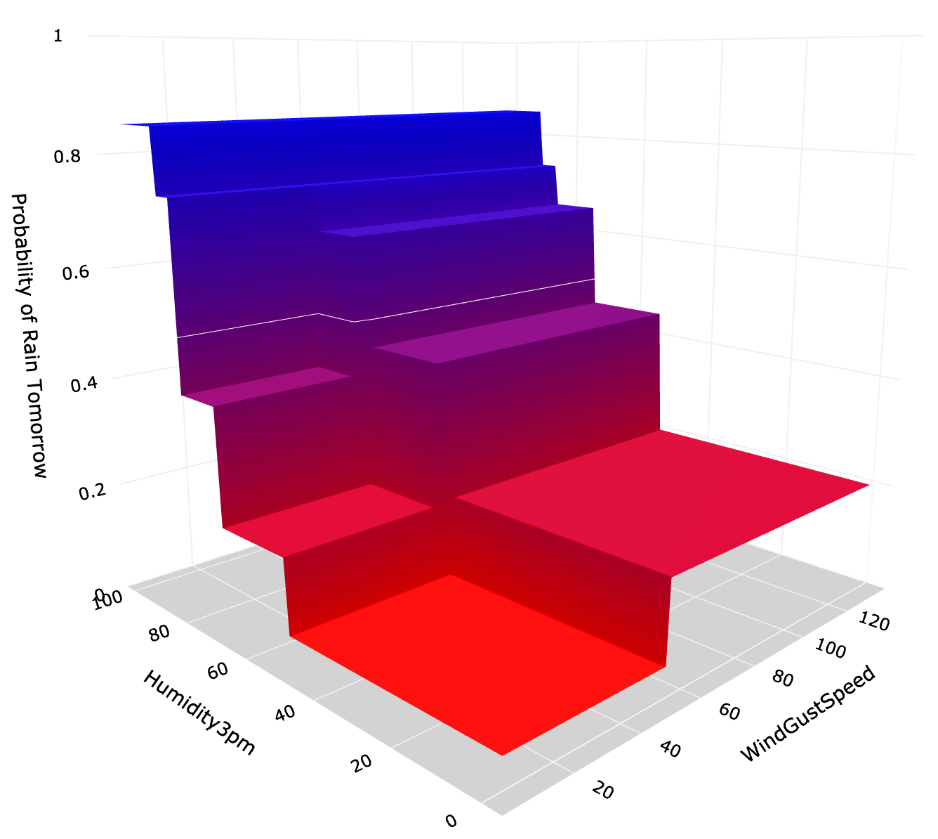
Let us start with a comparison of the prediction probability surface made by each of the three models. They all use the same Australian weather data:
Target (a.k.a dependent variable): 'Rain Tomorrow'. Possible values: 1 (yes, it rains) and 0 (no, it does not rain);
Features (a.k.a. independent variables): 'Humidity at 3 pm' today, 'Wind Gust Speed' today. Note, we use only two features to enable us to visualize the results easily.
Here are the model prediction planes. Note that you can use Python code in the last section of this story if you would like to replicate these graphs.


Interpretation
Let's interpret visualizations and see what they tell us about the differences in these algorithms. The z-axis in the above graphs is the probability of rain tomorrow. Meanwhile, the thin white line is the decision boundary, i.e., where the probability of rain = 0.5.
We will now quickly review CART and Random Forest before diving into AdaBoost.
1. Single Decision Tree (CART)
CART is an acronym for a standard decision tree algorithm that stands for Classification and Regression Trees. In this example, we have built a single decision tree, which goes 3 levels deep and has 8 leaves. Here is the exact tree for reference:

Every leaf within this tree gives us a probability of rain tomorrow, which is a ratio between the number of cases where it rained and the total number of observations inside that leaf. E.g., the bottom left leaf gives us a probability of rain tomorrow of 6% (2,806 / 46,684).
Each leaf corresponds to a flat surface in the 3D prediction graph, while the splits in the tree are the step changes. See the below illustration.

As you can see, this is a pretty simple tree that gives us only 8 different probabilities. 5 of those leaves lead to a prediction of no rain tomorrow (probability < 0.5), while the remainder 3 leaves suggest it will rain tomorrow (probability > 0.5).
If you would like to go deeper into the mechanics of the CART algorithm, you can refer to my earlier story here:
CART: Classification and Regression Trees for Clean but Powerful Models
2. Random Forest
The first thing to note is that in our case, Random Forest uses the same CART algorithm for its base estimator. However, there are a few major differences:
It builds many random trees and combines predictions from each individual tree to generate the final prediction.
It uses bootstrapping (sampling with replacement) to create many samples from the original data. These samples maintain the same size but have different distributions of observations.
Finally, it uses feature randomness to minimize the correlation between the trees. This is done by only making a random subset of features available to the algorithm at each node split.
In the end, Random Forest creates many trees (500 in our example) and calculates the overall probability based on the predictions by each tree. This is why the prediction plane surface is smoother compared to a single tree (i.e., it has many little steps instead of a few big steps).
You can find more details on Random Forests in my separate story here:
Random Forest Models: Why Are They Better Than Single Decision Trees?
3. AdaBoost
Finally, we arrive at the main topic of this story.
Like Random Forest, we use CART as a base estimator inside the Adaptive Boosting algorithm. However, AdaBoost can also use other estimators if required.
The core principle of AdaBoost is to fit a sequence of weak learners, such as decision stumps, on repeatedly modified versions of data. A decision stump is a decision tree that is only one level deep, i.e., it consists of only a root node and two (or more) leaves. Here is the example of 3 separate decision stumps from our AdaBoost model:

Similar to Radom Forest, the predictions from all weak learners (in this case, stumps) are combined through a weighted majority vote to produce the final prediction. The major difference, though, is how these weak learners are generated.
Boosting iterations consist of applying weights to each of the training samples (observations). Initially, those weights are equal across all observations, so the first step trains a weak learner on the original data.
Linking this to our example, it means that the first decision stump (first split) is the same as what you get using a single decision tree approach:

For each successive iteration, the sample weights are individually modified, and the learning algorithm is reapplied to the reweighted data. Those training examples that were incorrectly predicted at the previous step have their weights increased. Meanwhile, the ones that were correctly predicted have their weights decreased. Hence, each subsequent weak learner is thereby forced to concentrate on the examples missed by the previous ones.
In the end, combining all of the weak learners into a final prediction generates a much "flatter" distribution of predictions. This is because the algorithm deliberately reduced the weights on the most confident examples and shifted focus towards harder to classify ones. As a result, we have the model predictions displayed in the graph below.
Note, the more weak learners (stumps) you add, the "flatter" the prediction distribution becomes.
Prediction distribution
Another way to visualize the prediction distribution is with a simple frequency line chart. As expected,
The single decision tree has few spaced-out predictions.
Random forest shows a much more even distribution of predictions.
AdaBoost has all of its predictions located close to the decision boundary (at 0.5).
Performance
While the three approaches produced very different probability distributions, the final classification results were very similar. The performance can be evaluated in many ways, but for the sake of simplicity, I am only showing accuracy (on test sample) here:
Single Decision Tree: 82.843%
Random Forest: 83.202%
AdaBoost: 83.033%
While the performance can be slightly improved with some additional hyperparameter optimization, the similarity of the results above tells us that we are fairly close to extracting the maximum information contained within the features used.
AdaBoost Limitation
The resulting "flat" probability distribution of AdaBoost is its main limitation. Depending on your use case, it may not be an issue for you. Say if you only care about assigning the correct class, then the prediction probability is less relevant.
However, if you care more about the probability itself, you may want to use Random Forest, which provides you with probability predictions such as 9% or 78%, as shown in the rain prediction modeling above. This is in contrast to AdaBoost, where all predictions are much closer to 50%.

Python section
Now that we know how AdaBoost works and understand its differences from other tree-based modeling approaches, let's build a model.
Setup
We will use the following data and libraries:
Scikit-learn library for splitting the data into train-test samples, building AdaBoost model and model evaluation
Plotly for data visualizations
Let's import all the libraries:
Then we get the Australian weather data from Kaggle, which you can download following this link: https://www.kaggle.com/jsphyg/weather-dataset-rattle-package.
We ingest the data and derive a few new variables for usage in the models.

Next, let's build a model by following these steps:
Step 1 - select model features (independent variables) and model target (dependent variable)
Step 2 - split data into train and test samples
Step 3 - set model parameters and train (fit) the model
Step 4 - predict class labels on train and test data using our model
Step 5 - generate model summary statistics
The above code generates the following output that summarizes the model performance.

The model generalized quite well with similar performance on test data compared to training data. The number of estimators was 50, meaning the final model is comprised of 50 different decision stumps.
Finally, as promised, here is the code to generate the 3D prediction plane graph:
Conclusion
I sincerely hope that this story will help you choose the right algorithm for your use case. Thanks for reading, and feel free to use the above code and materials in your own Data Science projects.
Cheers! 👏 Saul Dobilas
Related stories you may like:
Gradient Boosted Trees for Classification - One of the Best Machine Learning Algorithms
XGBoost: Extreme Gradient Boosting - How to Improve on Regular Gradient Boosting?